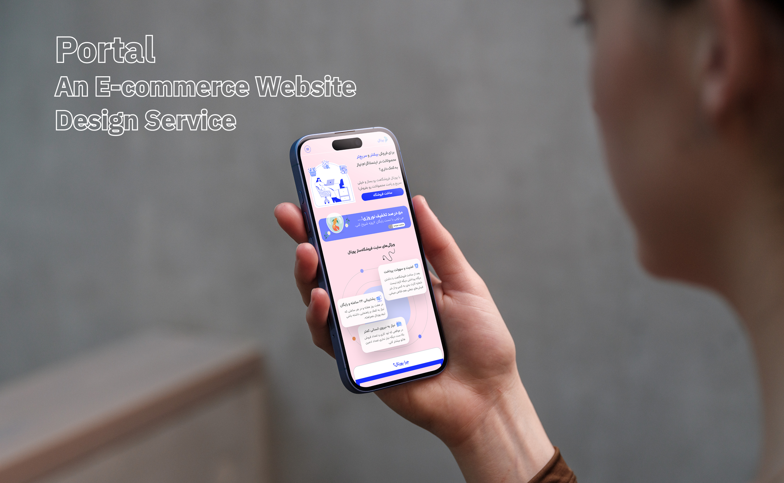
Portal
Redesign the promotional landing page website (Focusing on the mobile platform) and make it more user-friendly.
01
My role:
Ux researcher, Ui designer
02
Timeline:
Mar 2024 - Apr 2024
03
Tool Used
Figma, Adobe Illustrator, Photoshop
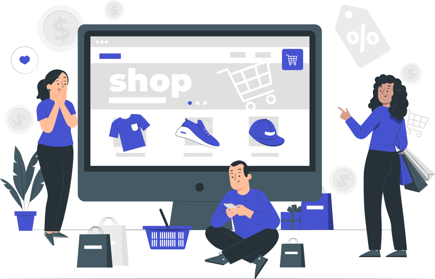
Business accounts in instagram are dealing with inquiries challenges (e.g. large amount of data), mostly acquired by DM (Direct Message). This means providing information about the product such as price, inventory, shipping, and even verifying payments.
Coming holiday season, a user friendly landing page can results in creating online shop demand. These users have limited time, so the contents need to be in summary and presented in an effective manner. Therefore, it helps shoppers to make a decision quickly.
Problem
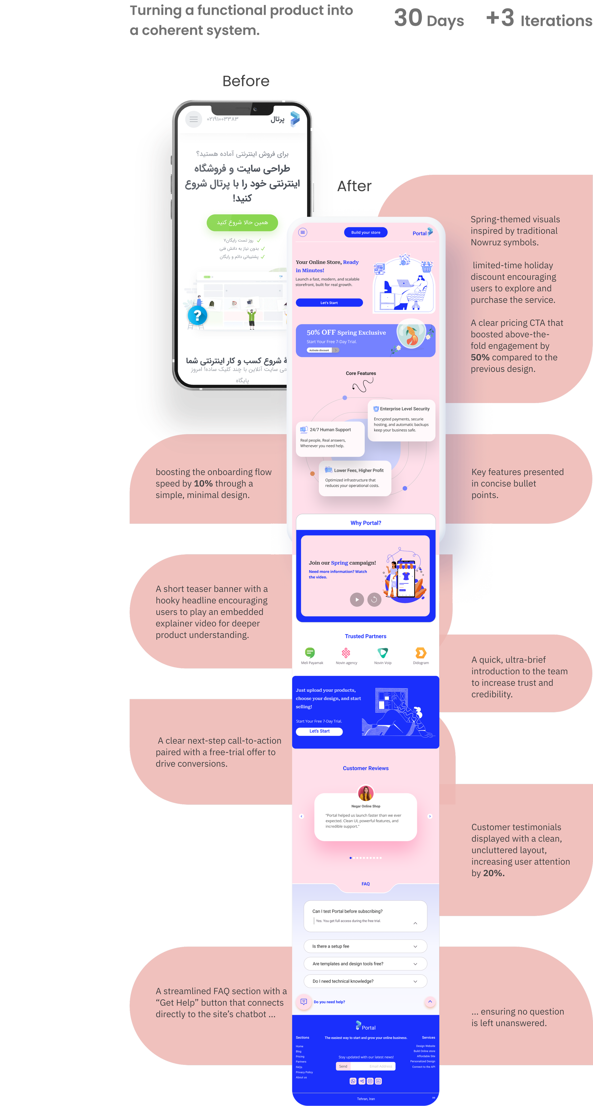
Video option for introducing the Website features:
This option is very attractive for our users due to their lack of time and the habit of using Instagram's reels.
First impressions:
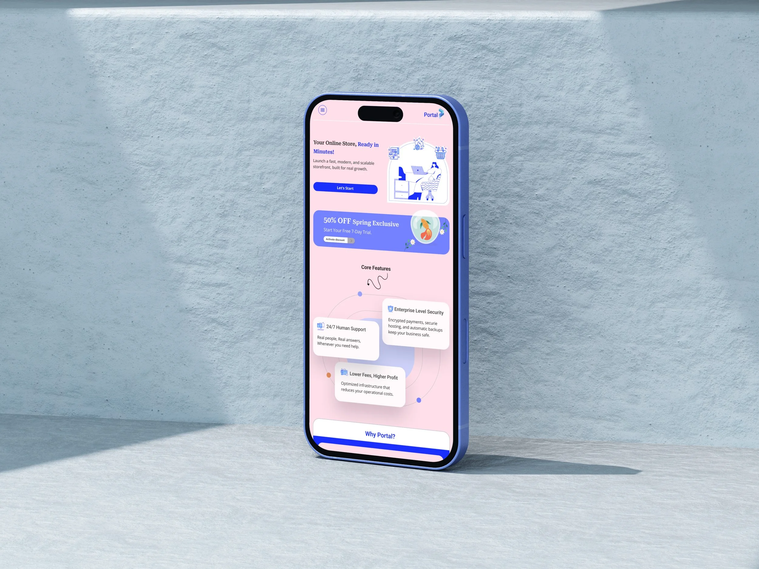
The most important part of the landing page is focuses on the hero section.
I used attractive illustrations and important data to catch the user's attention.
Reduced cognitive load:
I minimized the design of all parts and focused on the benefits.
Solution
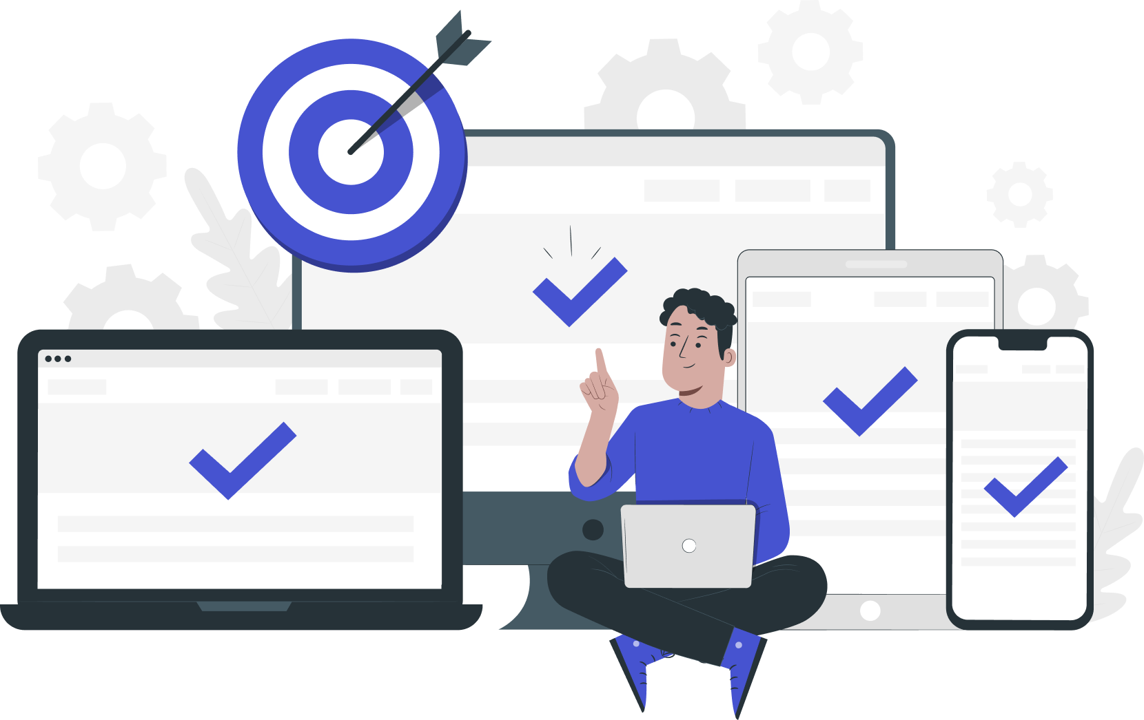
Project Goals
This project aims to redesign the promotional landing page website (Focusing on the mobile platform) and make it more user-friendly. The goal is to boost user satisfaction and make them eager to use the website’s services.
Content Clarity
Impressed At First Glance
User Friendly
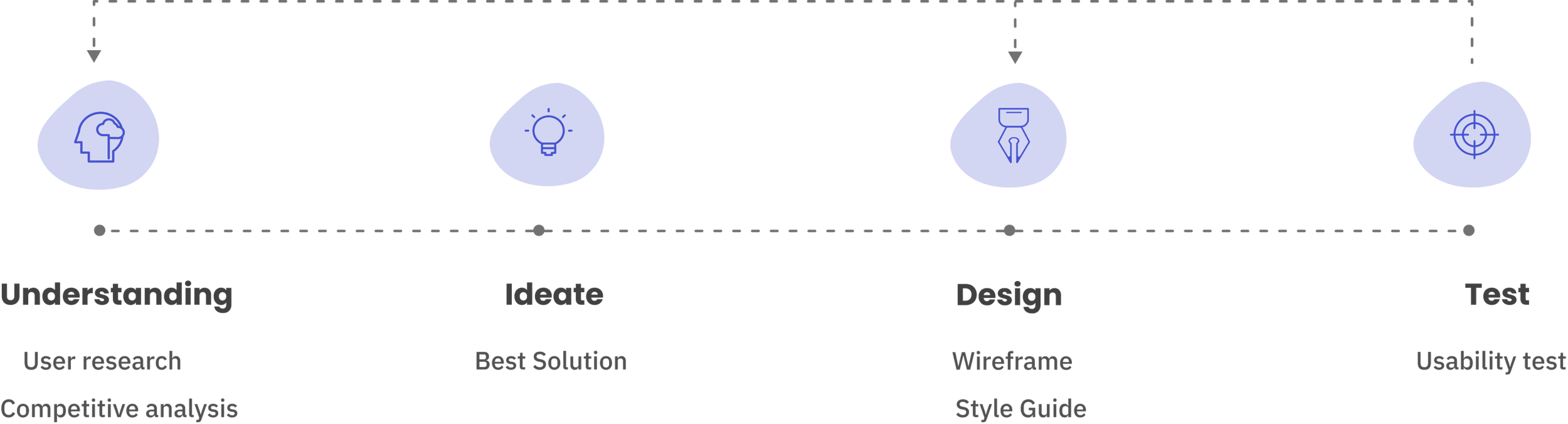
Process
User research
Our targets are busy Instagram sellers who deal with a lot of information and messages on a daily basis in limited times.
They need a safe and user-friendly platform that could saves their time without any more admins.
Most of their communication is in the field of phones.
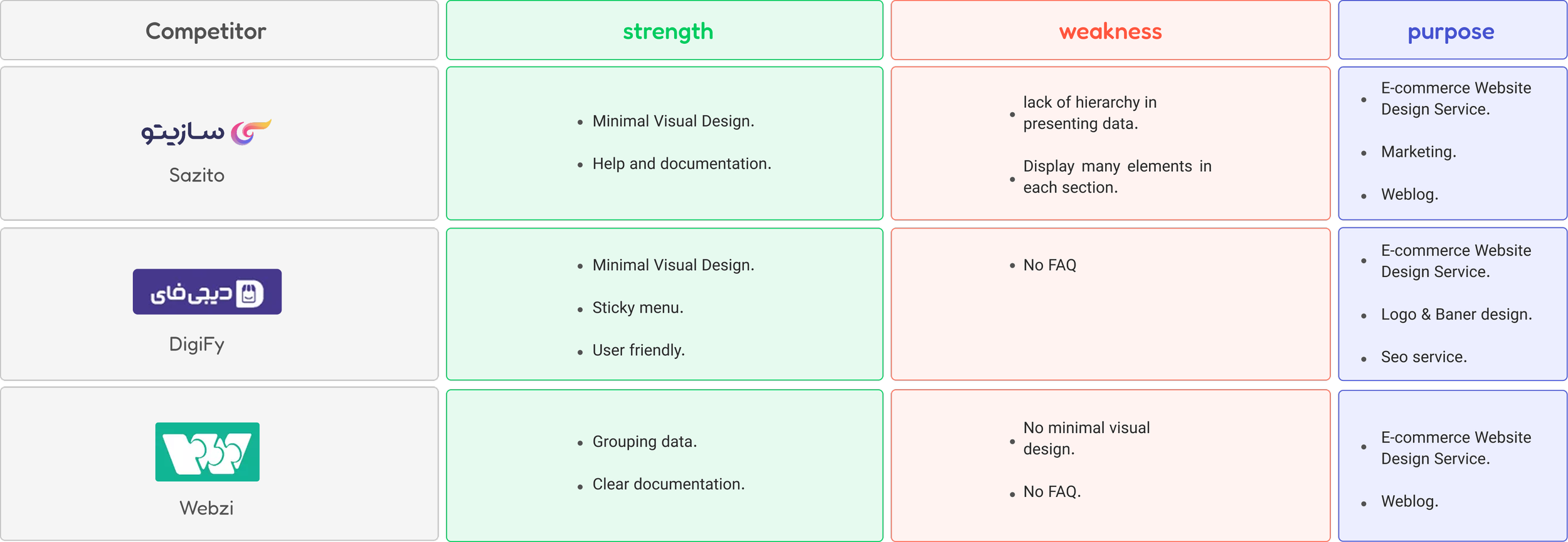
Competitive analysis
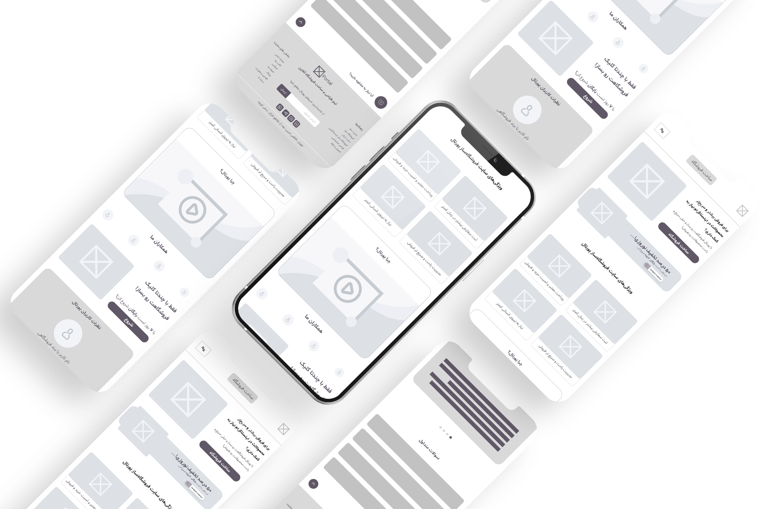
Wireframe Low-Fi
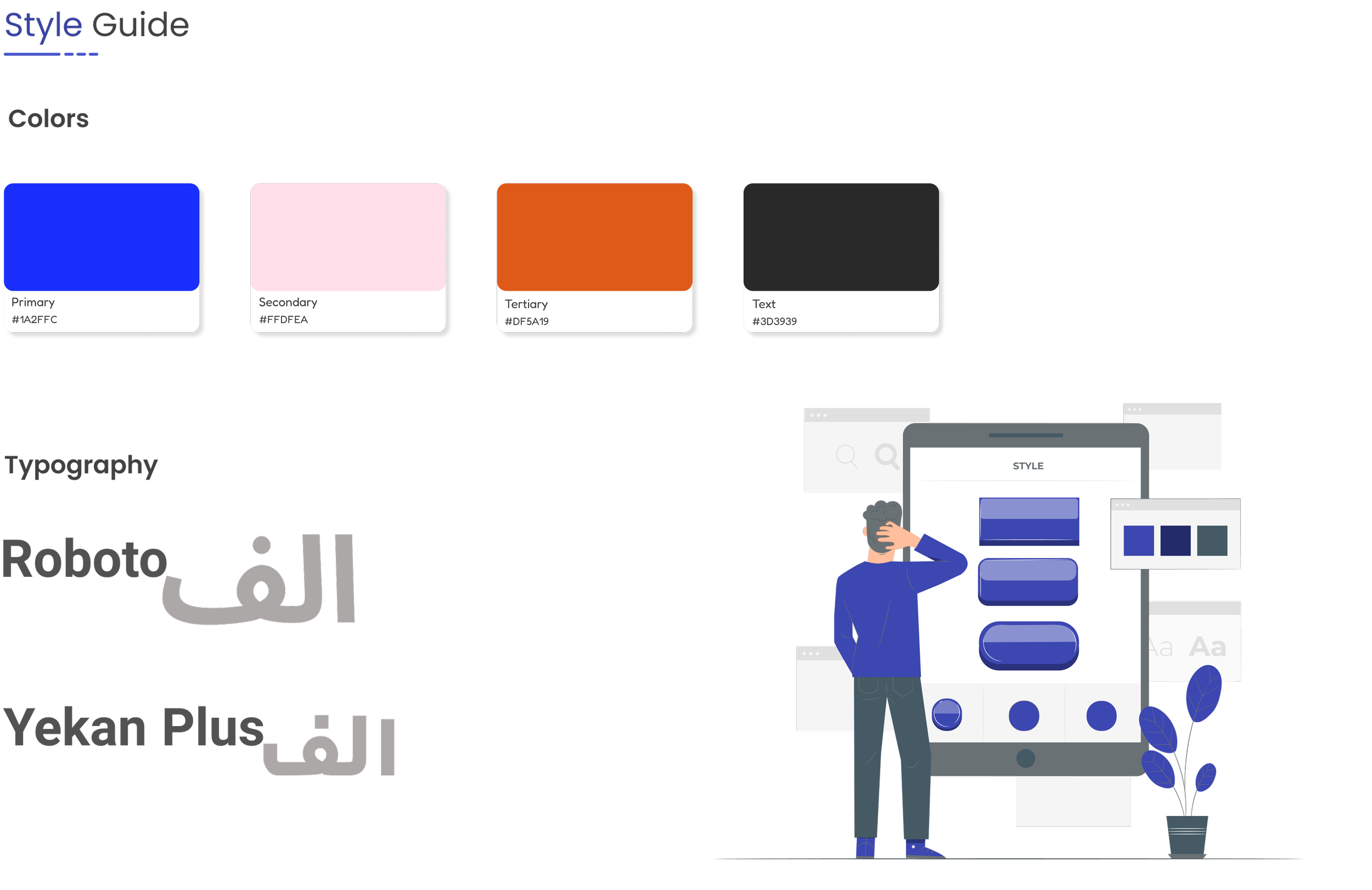
Design System
Testing
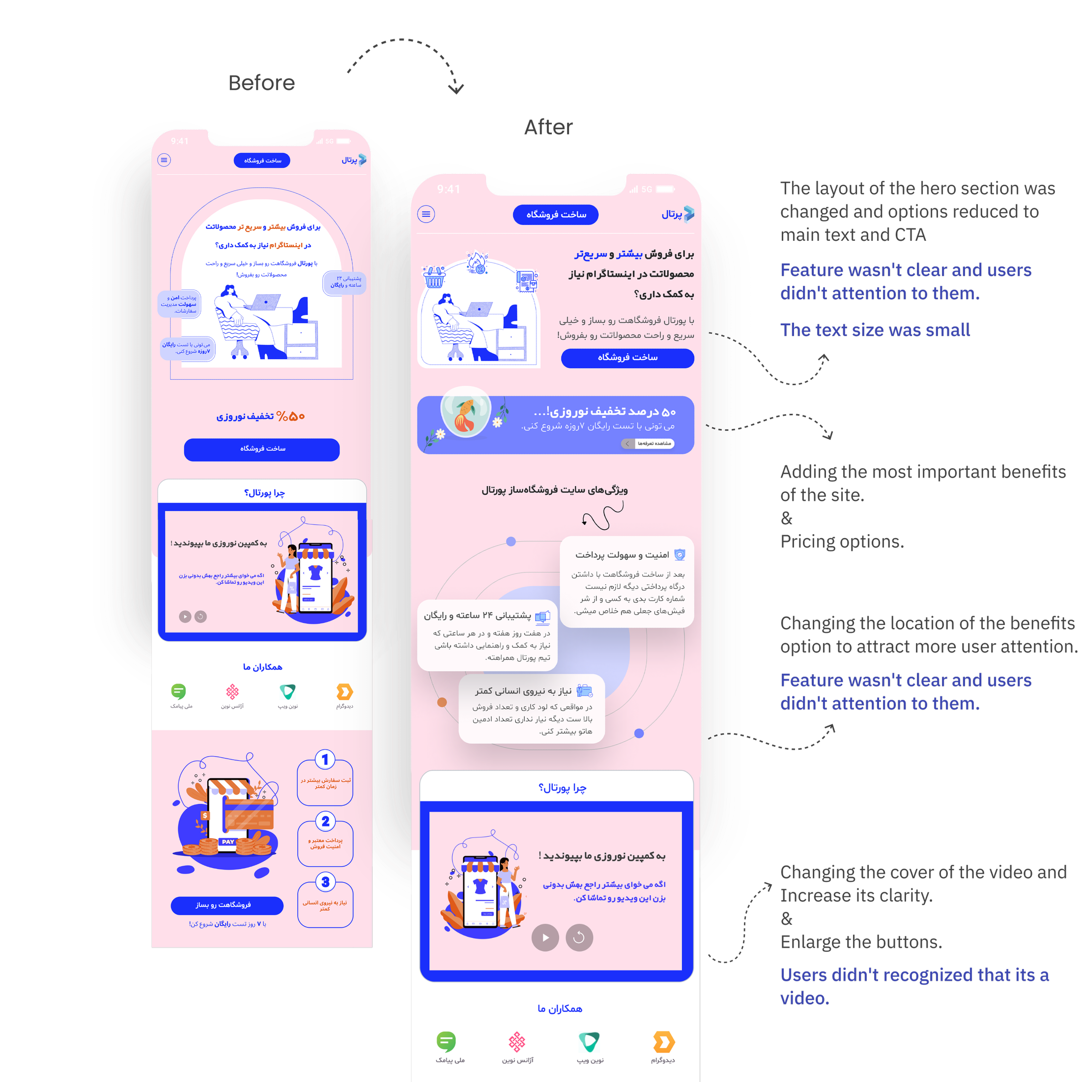
Regarding hard time for gathering users in holidays, I managed to find two case study (people) for the test.
Here are some of the important findings from the two test sessions:
Output of soft skills & knowledge
This project meaningful had so many benefits for me; not only I learned many things about Ui design (focused on a particular topic), but also it was a valuable learning experience in honing my soft skills.
This short internship taught me how to balance business goals with user needs, helping me understand how to navigate the space between the two. It served as a strong foundation for taking on more advanced, real-world projects.
In the design process, we had a mentorship group sessions with senior designers. Their feedback and fruitful guidance helped refining my design approach through challenges.