HopeTrack
Reimagining support for breast cancer care.
01
My role:
Ux researcher, Ui designer
02
Timeline:
Jan 2025 - Mar 2025
03
Tool Used
Figma, Mural
Empowering Patients to Navigate Breast Cancer with Confidence and Clarity.
Problem
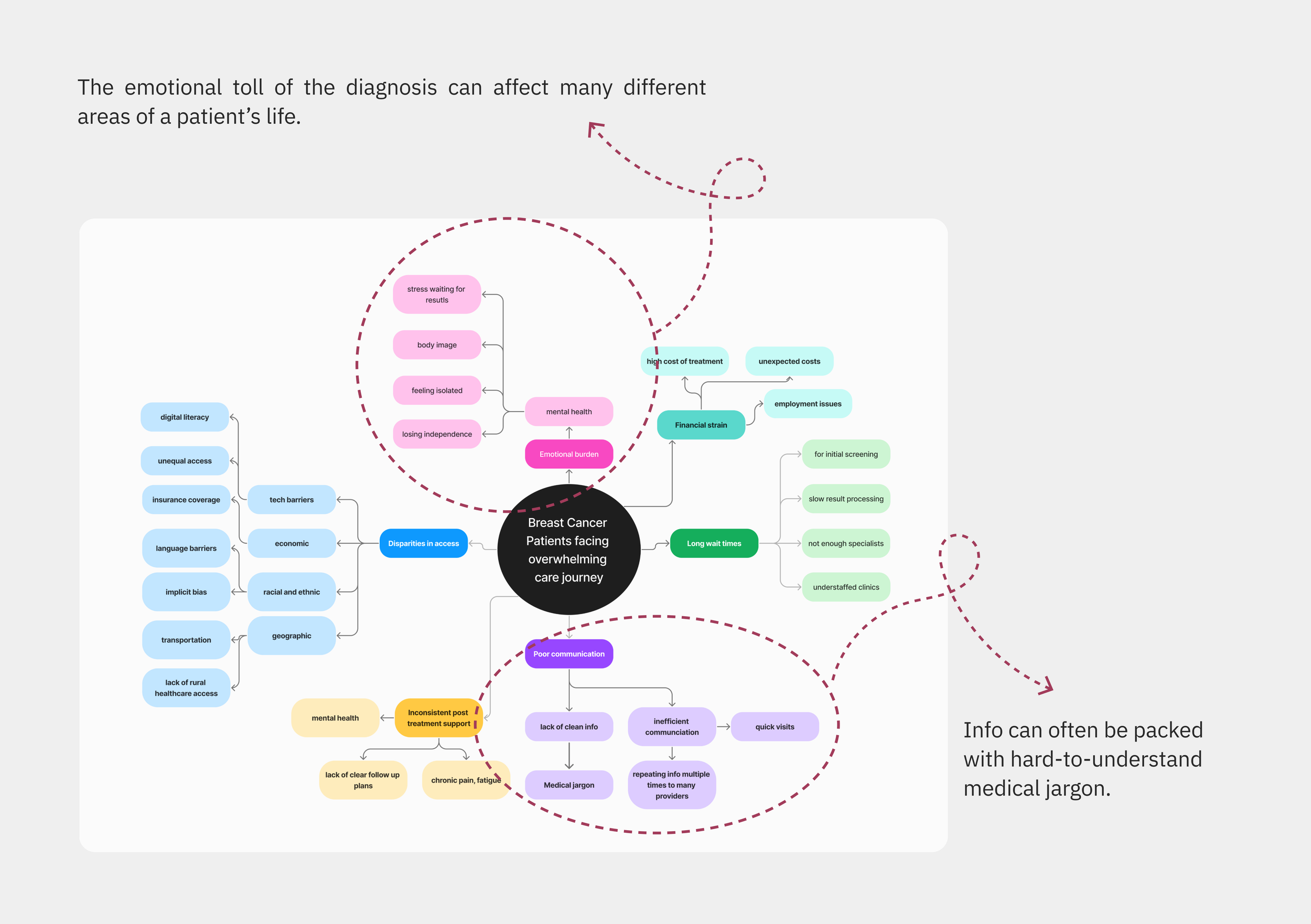
Breast cancer patients face an overwhelming healthcare journey. From diagnosis through recovery, patients struggle to track appointments, understand complex medical terms, and manage care plans.
The emotional weight of the diagnosis is made worse by scattered communication and limited support. Without guidance, patients experience more stress, delays, and difficulty making confident decisions. To understand the problem fully, a number of questions had to be addressed before focusing on a solid solution.
What does a typical breast cancer journey look like?
What obstacles do patients encounter throughout treatment and recovery?
What prevents patients from easily accessing the information they need?
Where are the most common pain points in the overall care experience?
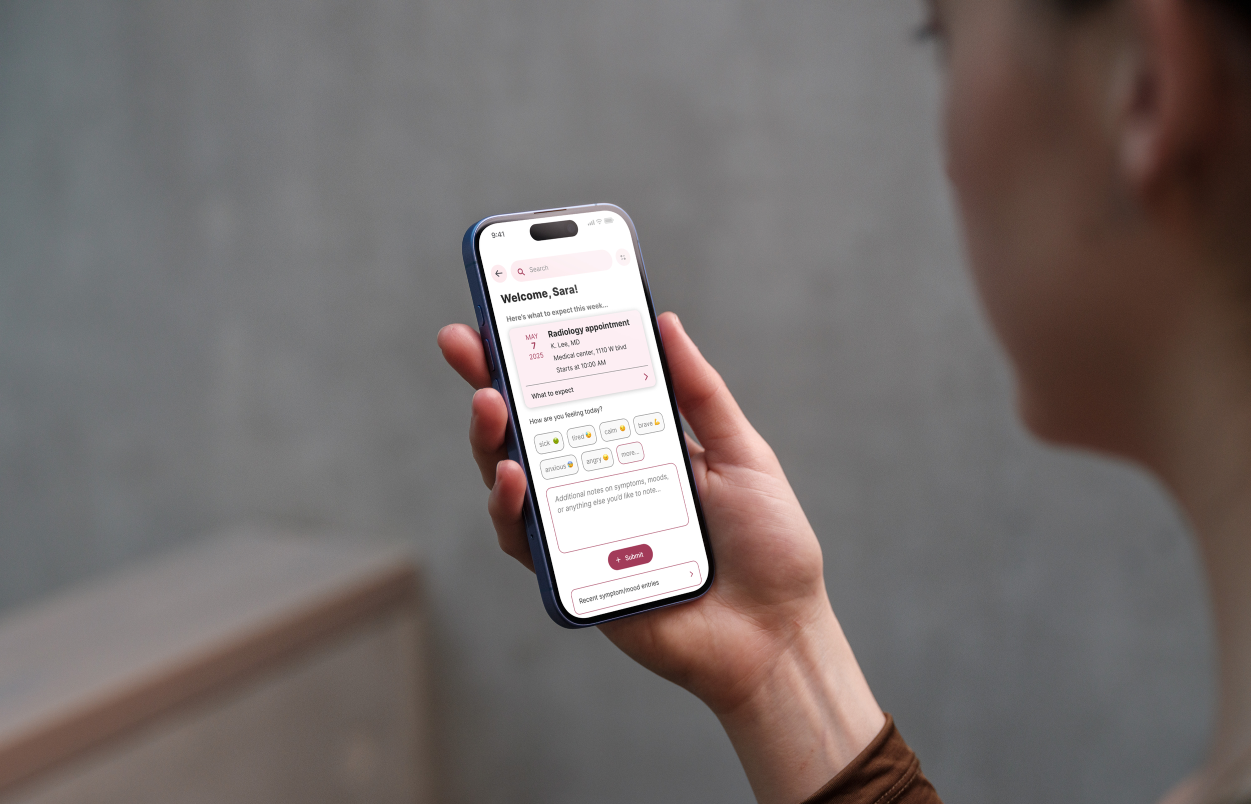
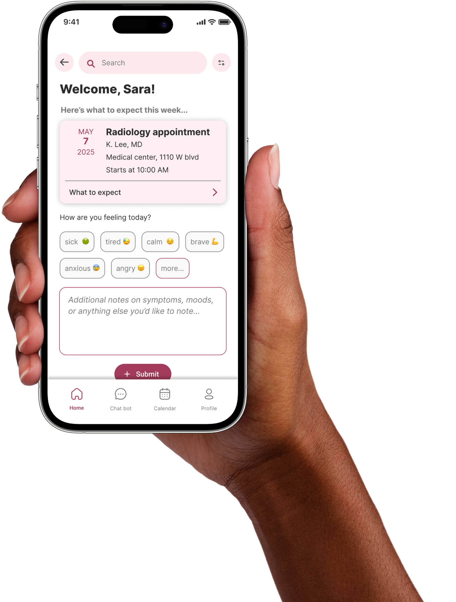
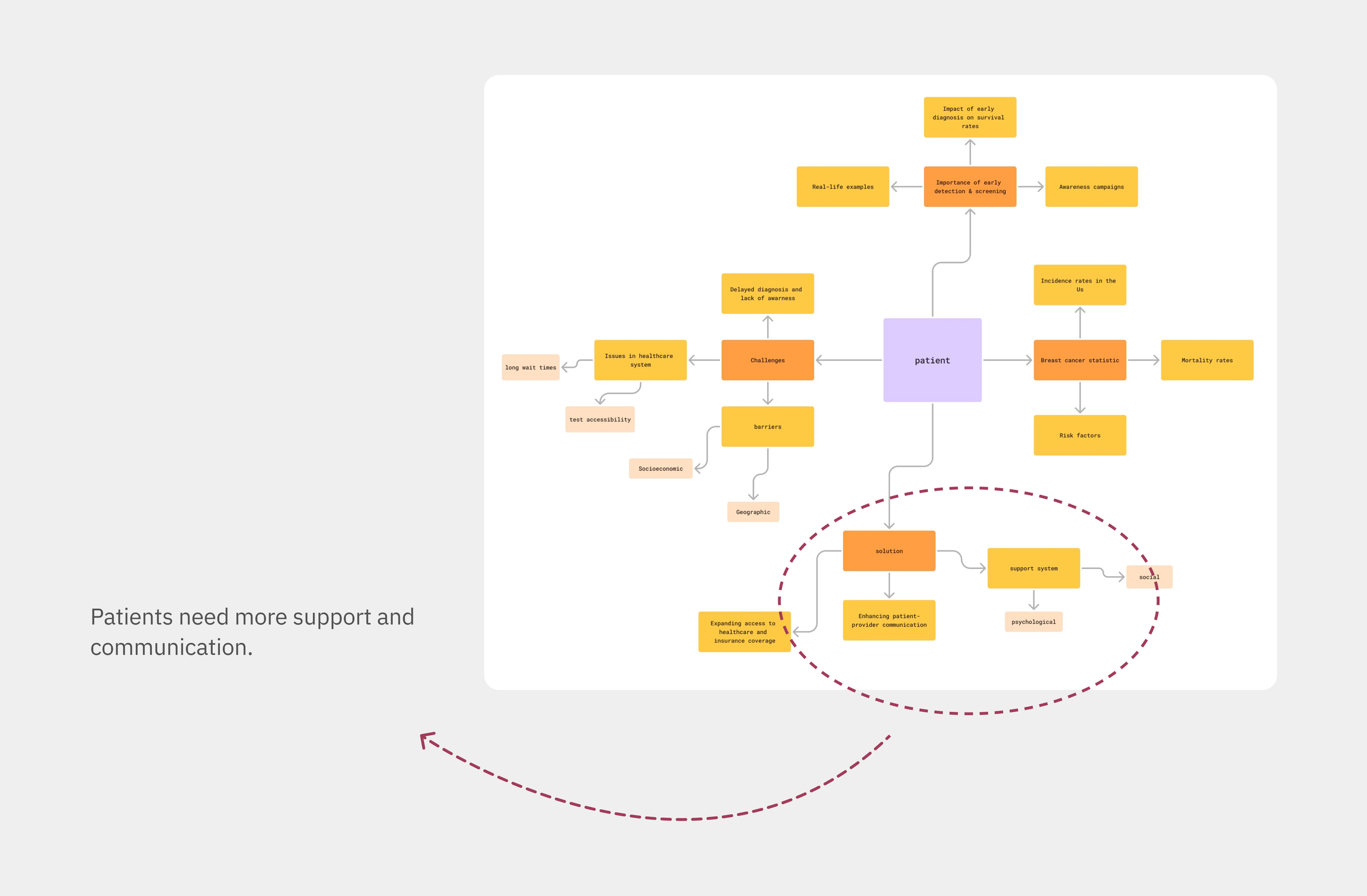
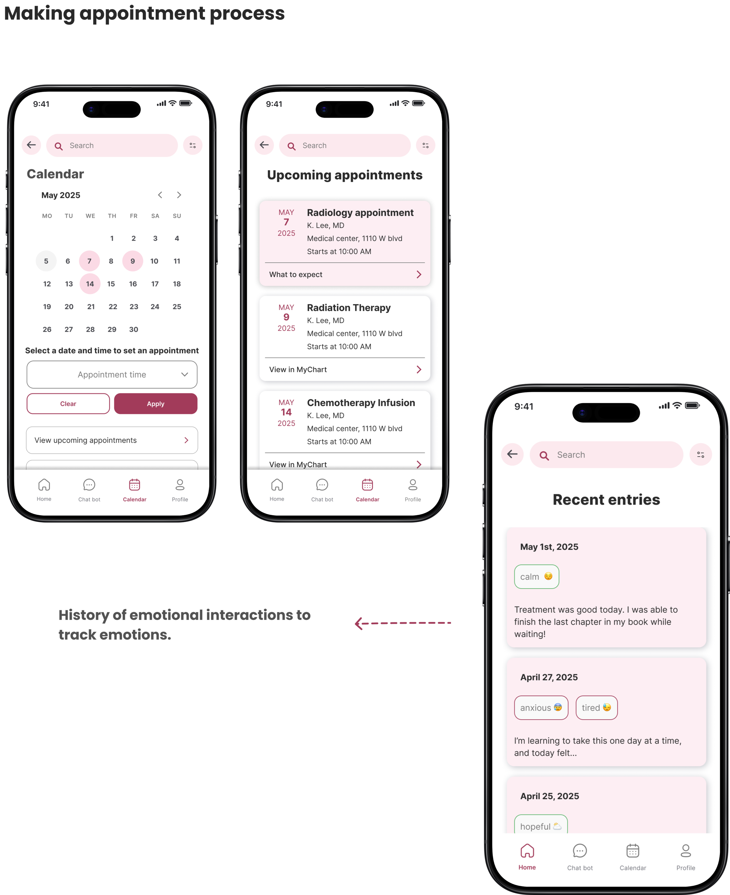
Solution
An app that helps breast cancer patients:
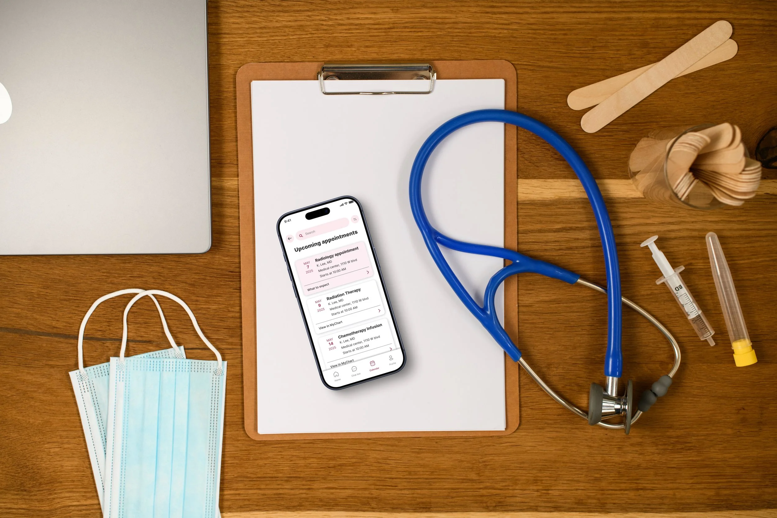
organize appointments.
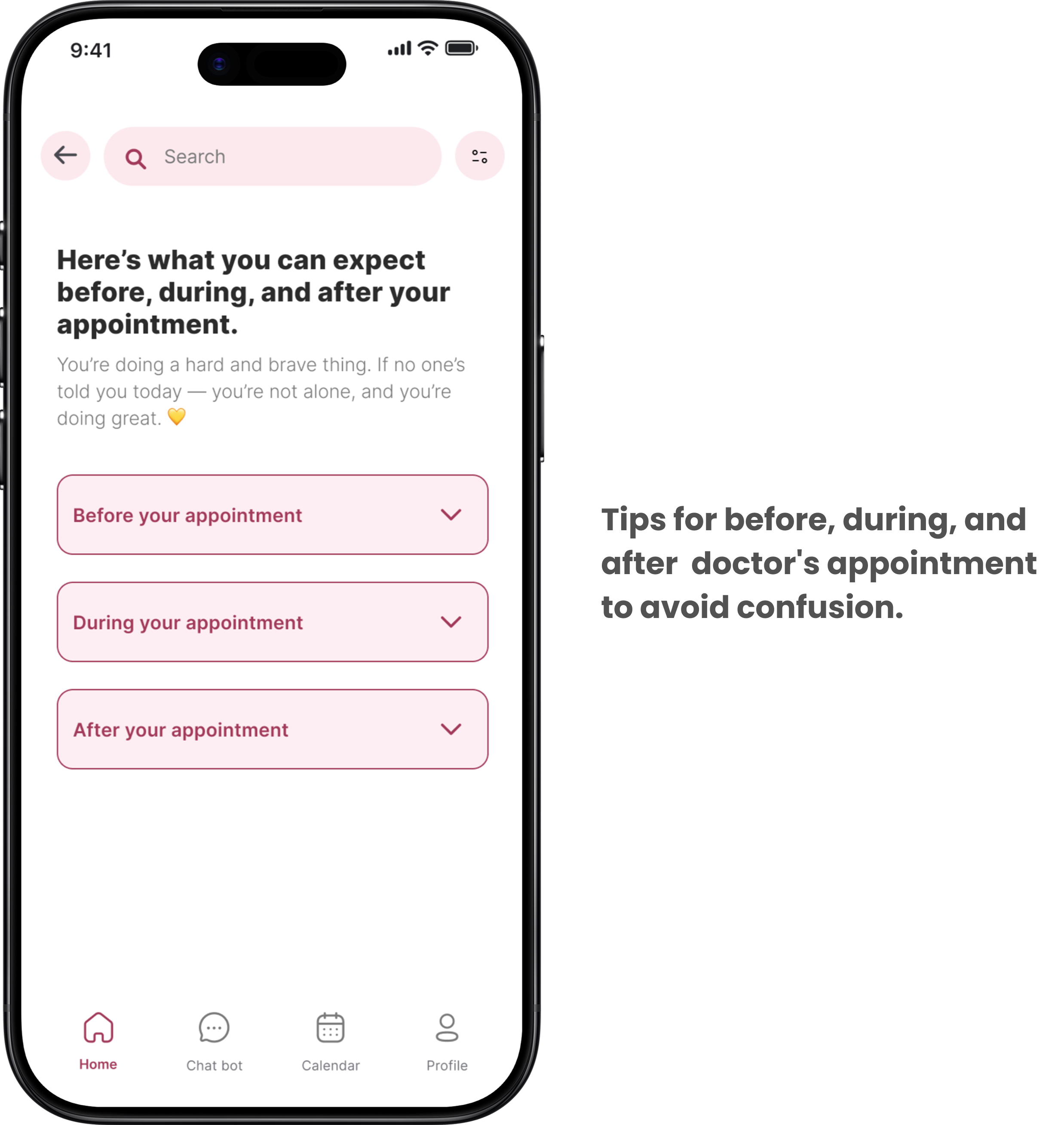
Reduce pre-appointment anxiety by providing clear.
Non-clinical information about what to expect.
Reflect through personal journal entries.
Receive emotional support from an AI chatbot.
This tool prioritizes compassionate, accessible language, offering patients a reassuring resource they can return to whenever they feel overwhelmed or anxious.
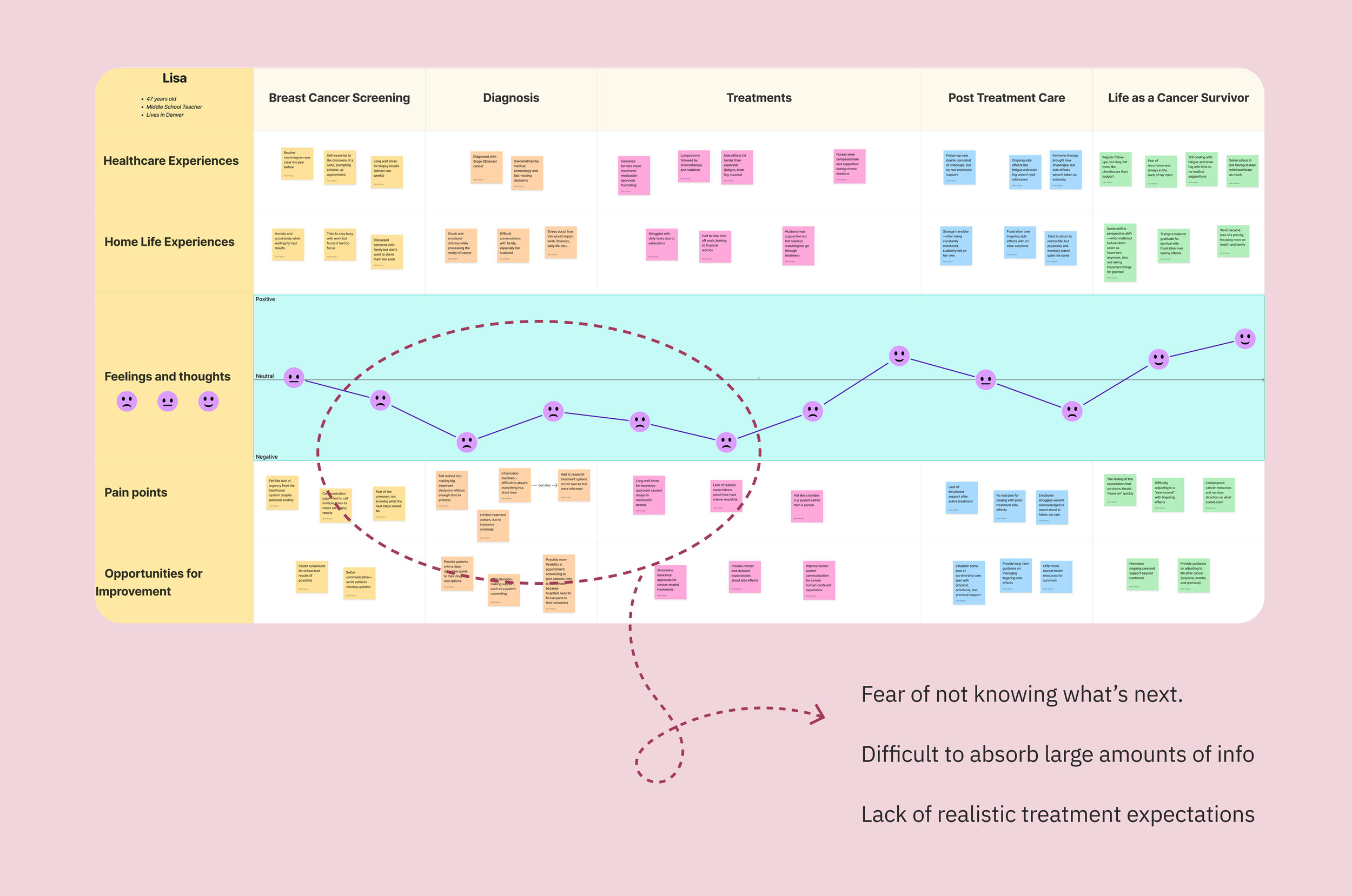
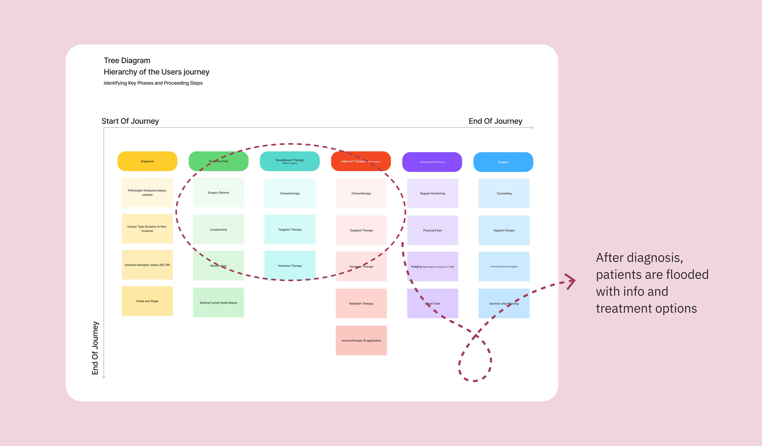
Process
Journey map & tree diagram
Graphic Organizer & Concept Map
Interviews & Key insights
We spoke with breast cancer patients and healthcare providers to understand their emotional needs, informational gaps, and day-to-day challenges during treatment.
key finding 1
Faith, family, and personal resilience were central to emotional coping.
“I believe in the joy of life and my family, so I just kept pushing through… I’m a farm girl and an athlete.”
key finding 2
There’s a significant lack of support during the transition from treatment to survivorship.
“You go from being monitored all the time to just being on your own.”
key finding 3
Patients often felt overwhelmed and underinformed at the start of treatment due to medical jargon and rushed decisions.
Patients often had to do their own research.
“Everything was happening fast... there was a lot of medical jargon. [I] had to do research on my own and ask a ton of questions.”
Research Question
How can a centralized digital tool improve the ability for breast cancer patients to manage their care, reduce stress, and feel more confident throughout their entire breast cancer journey?
Value Hypothesis
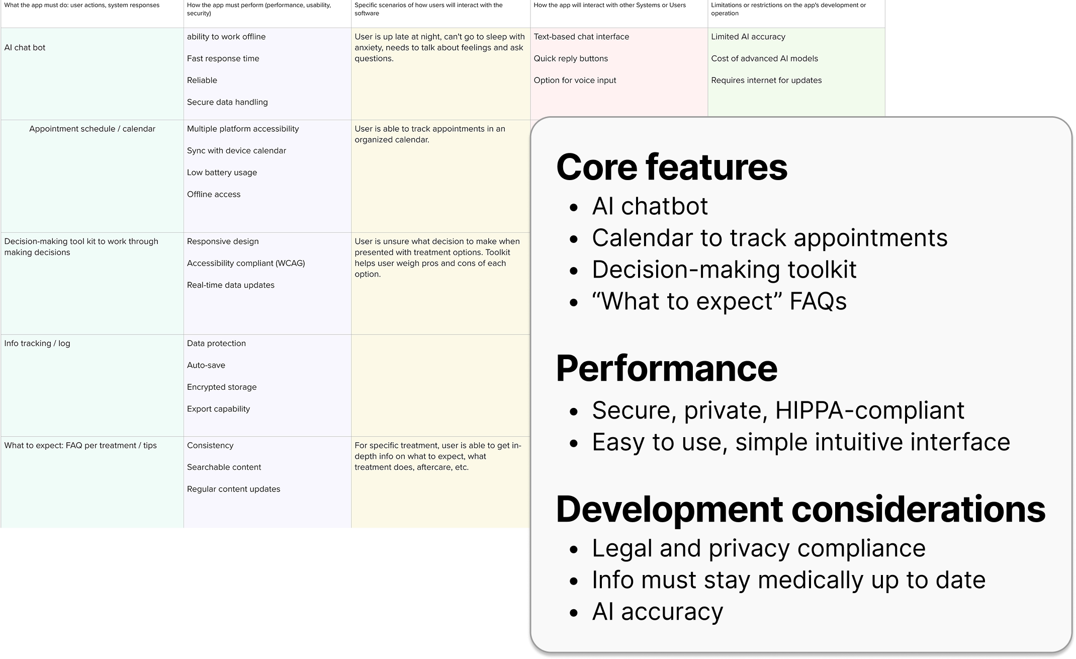
Breast cancer patients are underserved by current systems lacking centralized, accessible support. The proposed solution is an app designed especially for breast cancer patients.
It will offer appointment management, a treatment and information index, and an integrated AI chatbot to answer questions in real time. This tool directly addresses the unique challenges breast cancer patients face, helping them feel more confident, informed, and supported.
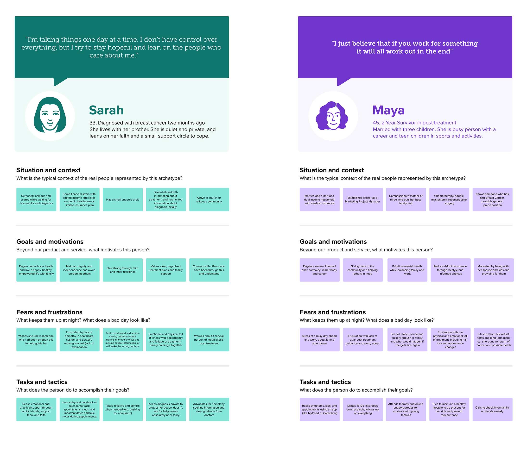
Personas were based on interviews with real patients to understand their goals, emotions, and daily challenges.
Personas
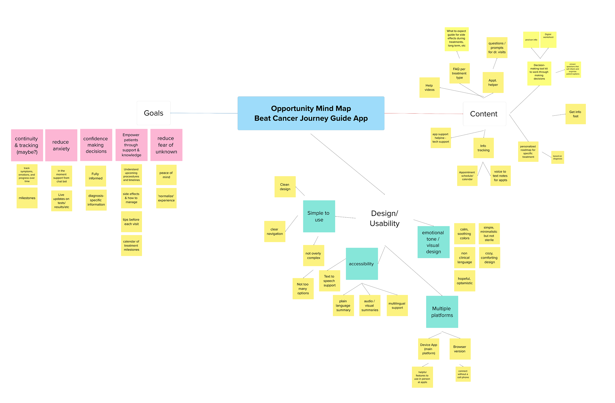
A brainstorm session of goals, features, and ideas for a breast cancer app that reduces anxiety and supports confident, informed care.
Opportunity Map
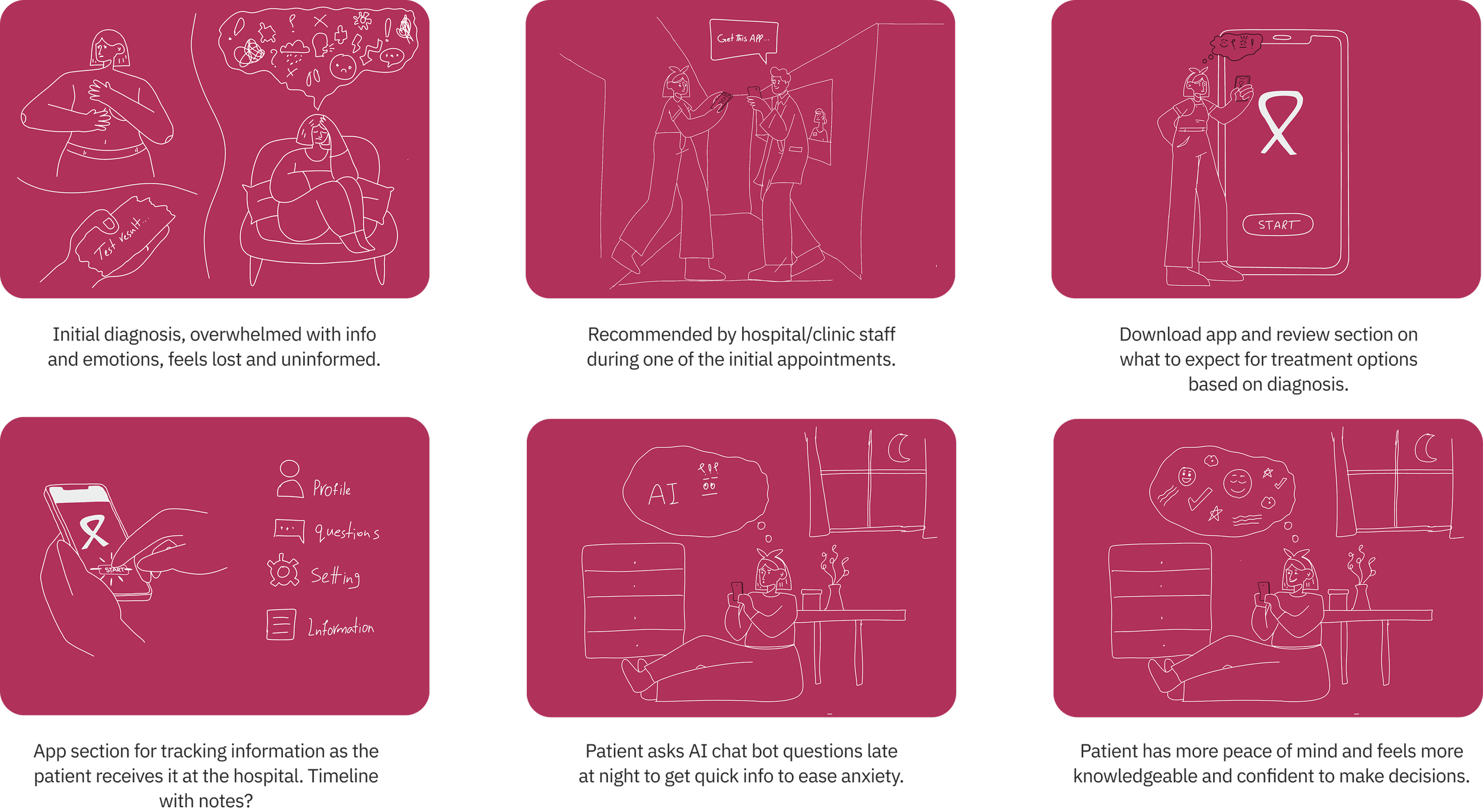
Story Board
Design Principal
This app was designed with some specific principles in mind—to make sure every interaction feels informative, supportive, and simple for patients as they navigate their breast cancer journey.
Empowered Navigation
Prioritizing user control and autonomy throughout the journey.
Compassionate Design
Grounded in human-centered design with empathy.
Responsive Feedback
Timely responses that reduce anxiety and guide next steps.
Accessible
Inclusive of all accessibility needs.
Transparent Design
Clarity and honesty to build trust and reduce uncertainty.
Clear Information
Structured hierarchy to avoid overwhelm and support decision making.
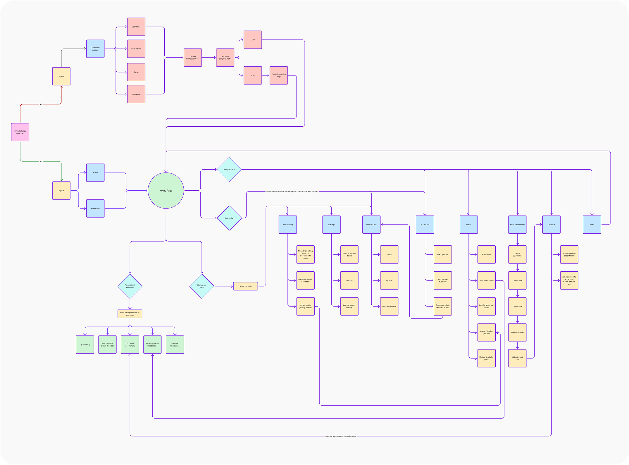
To move away from abstract ideas and think more concretely, we designed a user flow for all parts of our product, which helped us establish a more logical and usable process.
User Flow
Low fidelity wireframes were created to quickly explore ideas, test layouts, and gather some early feedback before investing time in detailed, high fidelity prototypes.
Low-Fi Wireframes
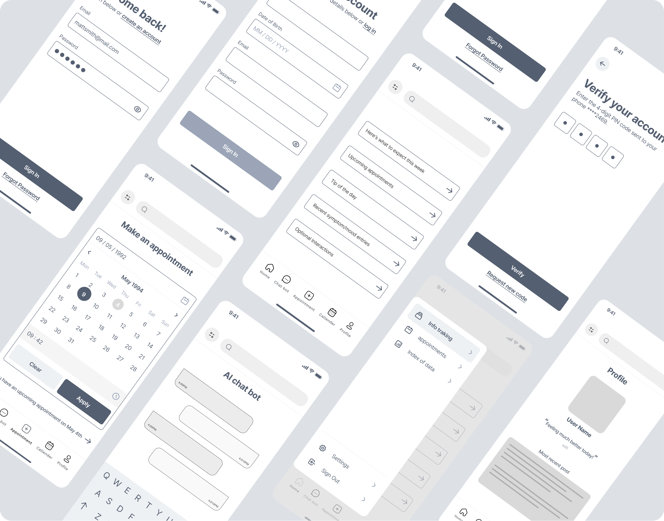
High-Fi Wireframe
High fidelity wireframes were developed to closely resemble the final product, incorporating more detailed visual design, accurate layout, and some interactive elements to validate usability and refine user flows.
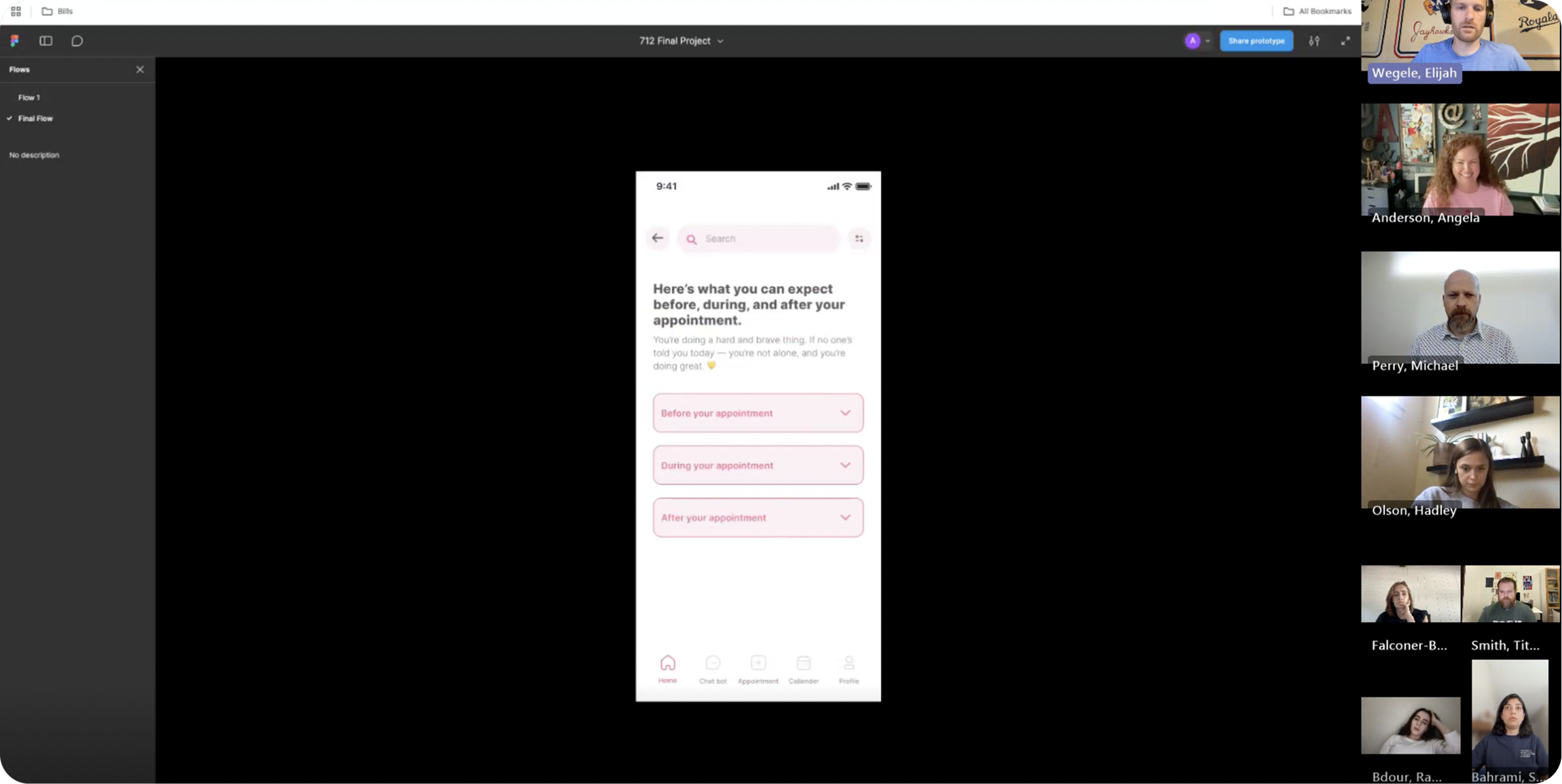
Usability Testing
We ran a usability test to assess the app’s navigation and overall effectiveness.
We asked the participant to complete tasks with minimal instruction to simulate real-world usage.
During the session we observed behavior, noted pain points, and asked follow-up questions.
This feedback helped us further refine the design.
Explore the prototype Here
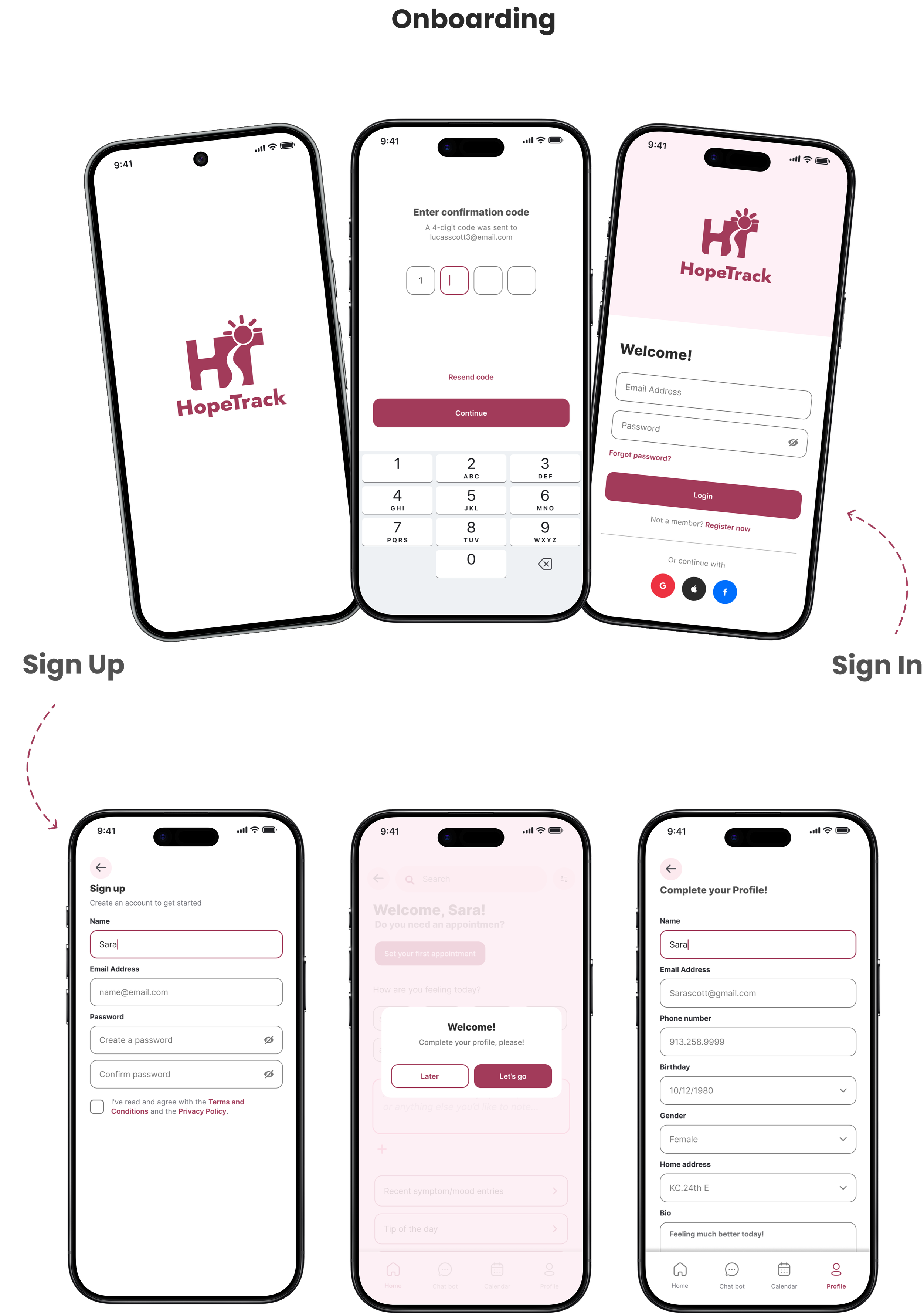
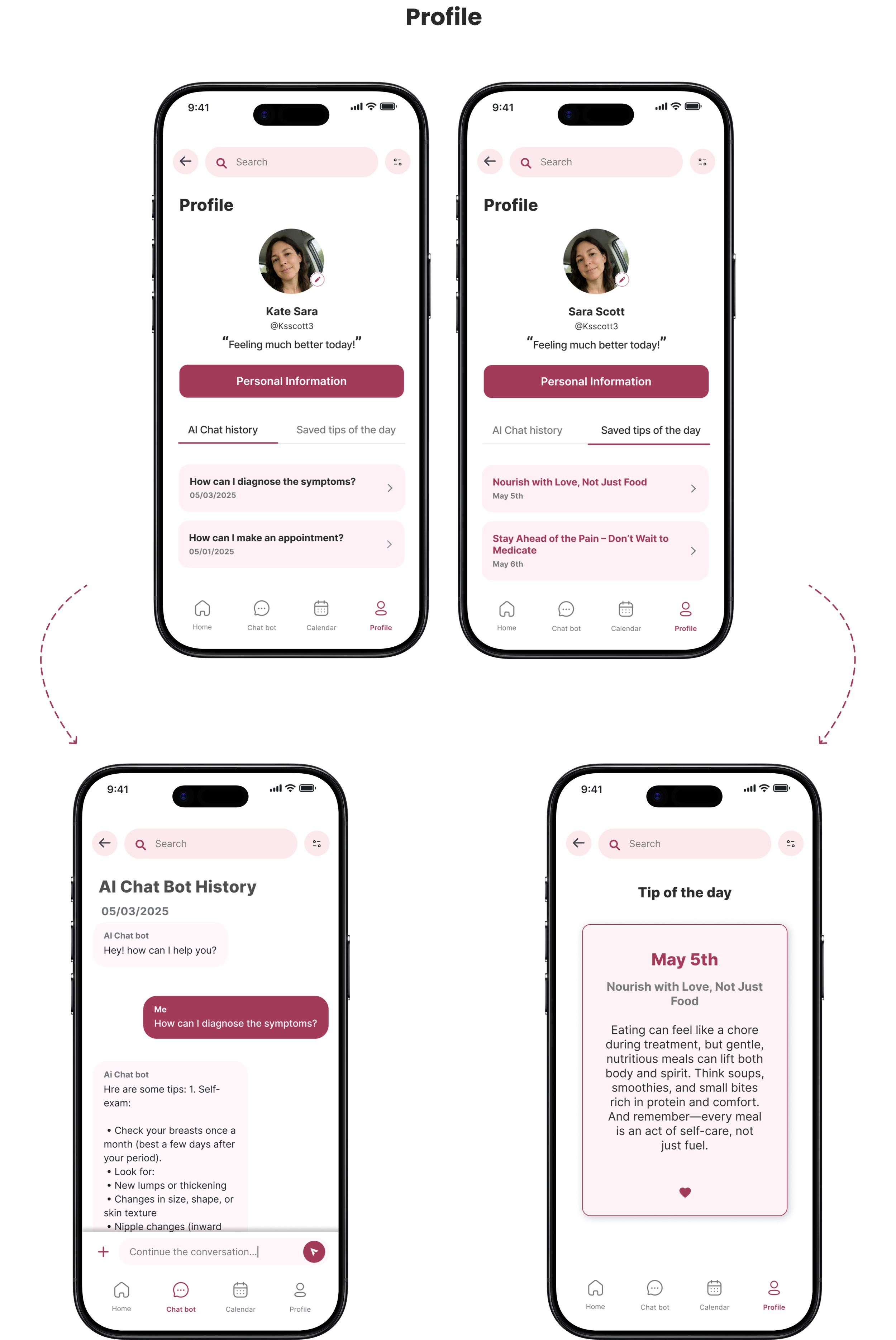
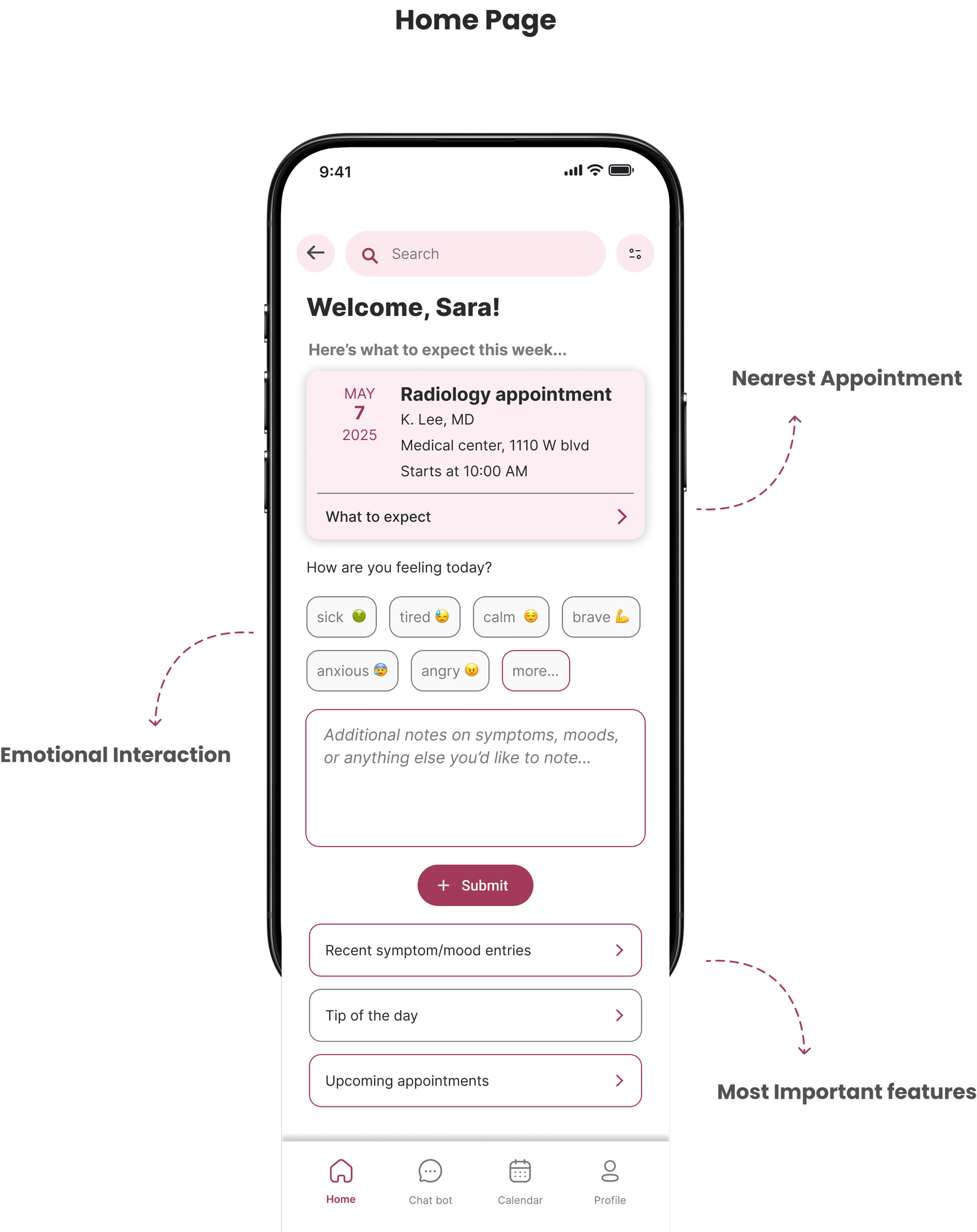
After conducting research and interviews, testing both low and high fidelity wireframes, and developing a consistent brand aligned with our vision, we brought the HopeTrack app to life with a more refined and functional design.
We improved the UI, added new features, enhanced existing ones, incorporated user feedback, and adjusted colors to meet accessibility standards.
Key Benefits
A supportive digital guide that reduces anxiety, builds understanding, and helps patients navigate their cancer journey with greater peace of mind.
Reduces anxiety through clear, structured information.
Supports decision-making with personalized prompts and preparation.
Builds emotional resilience with continuous AI support and reflection tools.
Creates a sense of connectedness through simple, human-centered design.
Further Feedback - Next steps
Further user testing was conducted by walking through the task list and prototype model with a previously interviewed patient. In her initial interview, she had expressed that there were many aspects of her experience she didn’t fully understand, saying, “My mouth hurt and I had mouth sores. I couldn’t eat, and I got really thin. The recovery was so difficult.”
During the walkthrough, she found the steps to be very intuitive and appreciated the idea of the app linking to her MyChart portal. She noted that a tool like this could significantly help reduce stress and anxiety, explaining, “There’s just so much unknown... you never really know quite what to ask.” She also pointed out that, for many people, their first experience with cancer is their own, making support and guidance all the more important.
An additional area worth exploring is the integration of a personalized “Tip of the Day” feature that aligns with users' religious or spiritual beliefs. She shared that her faith played a crucial role in her journey and that daily faith-based encouragement would have had a meaningful impact. “My faith helped me get through a lot,” she said, “and having daily tips related to that would have had a major impact on me.”
Output of soft skills & knowledge
Throughout this course, I explored design methods both theoretically—drawing from 101 Design Methods by Vijay Kumar and Universal Methods of Design by Bruce Hanington—and practically, through weekly hands-on projects. These exercises expanded my design perspective and, through the final project on breast cancer awareness, solidified my learning with mentorship and feedback from the instructor.
On the soft skills side, regular class presentations and facilitation sessions strengthened my communication and leadership abilities. Collaborating with a diverse team for the final project also allowed me to refine my teamwork and adaptability skills in a new cultural and academic environment.