
What struggling to find a book on Goodreads taught me about search UX!
It All Begins Here
A UX perspective on cognitive overload and broken discovery patterns.
The Moment I Noticed the Problem
When I searched for a specific book on Goodreads, I had to scan the results multiple times just to confirm I was looking at the right one.
Titles, authors, ratings, and bolded keywords were all competing for attention. Everything felt important — which made it hard to know where to look first.
That experience raised a simple question for me:
Why does finding a known book feel harder than it should?
Why This Problem Matters
Search is one of the most critical entry points in a reading platform.
When users search for a book, their goal is usually very clear:
“Is this the book I’m looking for — and is this the best edition?”
If the interface fails to guide attention effectively, users are forced to slow down, compare manually, and second-guess their choices. Over time, this friction erodes trust in the system and makes decision-making unnecessarily effortful.
What I Found During the Heuristic Review
I conducted a heuristic evaluation of the Goodreads search results page to understand why the experience felt overwhelming.
Several patterns emerged repeatedly:
• The page lacked a clear visual hierarchy.
• Keyword bolding was used to signal relevance, but it disrupted scanning instead of supporting it.
• Important information (title, author, cover image) was present, but not visually prioritized.
• Users were asked to choose between Title, Author, or Both, even though their intent was often obvious.
Across multiple heuristics, one issue stood out consistently:
The interface did not support how users naturally scan and compare search results.
This insight became the foundation for the usability study.
Research Question & Hypothesis
Research Question
Does improving visual hierarchy and relevance prioritization in Goodreads search results help users identify books and editions more efficiently?
Hypothesis
A redesigned search results page with a clearer visual hierarchy and default prioritization of high-rated editions will increase task success, improve user confidence, and reduce cognitive load.
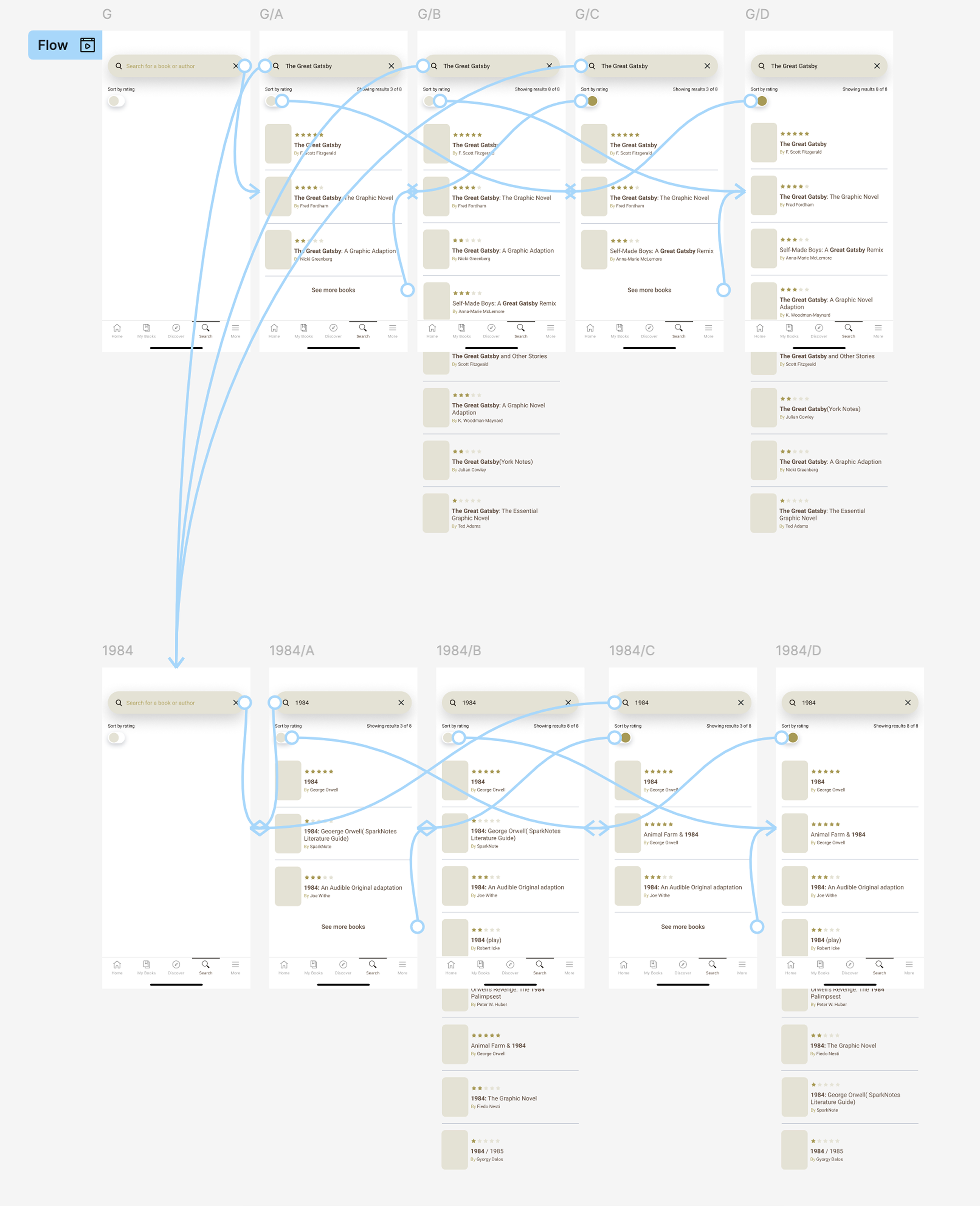
The Mid-Fi Wire Frames
How I Tested the Hypothesis
I ran a moderated usability test comparing the current Goodreads search experience with a redesigned version.
Participants
Three participants who regularly use book-related apps or websites and are familiar with searching by title or author.
Test Conditions
• Condition A: Current Goodreads search results
• Condition B: Redesigned search results with improved hierarchy and relevance cues
Tasks
1. Find The Great Gatsby by F. Scott Fitzgerald.
2. Find the highest-rated edition of 1984.
Measures
• Time on task
• Self-reported confidence (1–5 scale)
What I Observed — Task 1
Finding The Great Gatsby
In the current design, participants relied heavily on keyword bolding and scanned multiple results before committing to a selection. Even when they succeeded, the process felt cautious and effortful.
In the redesigned version, participants immediately focused on the book title and cover image.
They reported that the layout felt clearer and more organized, even when time on task did not decrease dramatically for every user.
Key takeaway:
Improved visual hierarchy reduced hesitation and increased confidence.
What I Observed — Task 2
Finding the Highest-Rated Edition of 1984
This task revealed a deeper insight.
In the current design, participants were unable to confidently identify the highest-rated edition. Confidence scores were extremely low, and users expressed uncertainty about how results were ordered.
In the redesigned version, all participants successfully completed the task. Confidence increased significantly.
However, time on task initially increased.
Why?
Participants assumed that the best or highest-rated edition would automatically appear at the top of the results. When this expectation wasn’t met, they spent extra time scanning or using the “Sort by Rating” toggle.
This moment exposed a mismatch between system behavior and user mental models.
Iteration Based on User Mental Models
Based on this insight, I iterated the design:
• The top two highest-rated editions are now prioritized automatically.
• The “Sort by Rating” toggle remains available for users who want full control.
This adjustment aligned the interface with user expectations while preserving flexibility.
After this change, time on task decreased without sacrificing confidence or success rates.
Final Design Outcome
The final design focuses on supporting fast comparison rather than detailed reading:
• Clear visual hierarchy: Book Cover → rating → title → author
• Reduced visual noise by removing unnecessary keyword emphasis
• Default prioritization of high-rated editions
• Optional sorting controls instead of mandatory filters
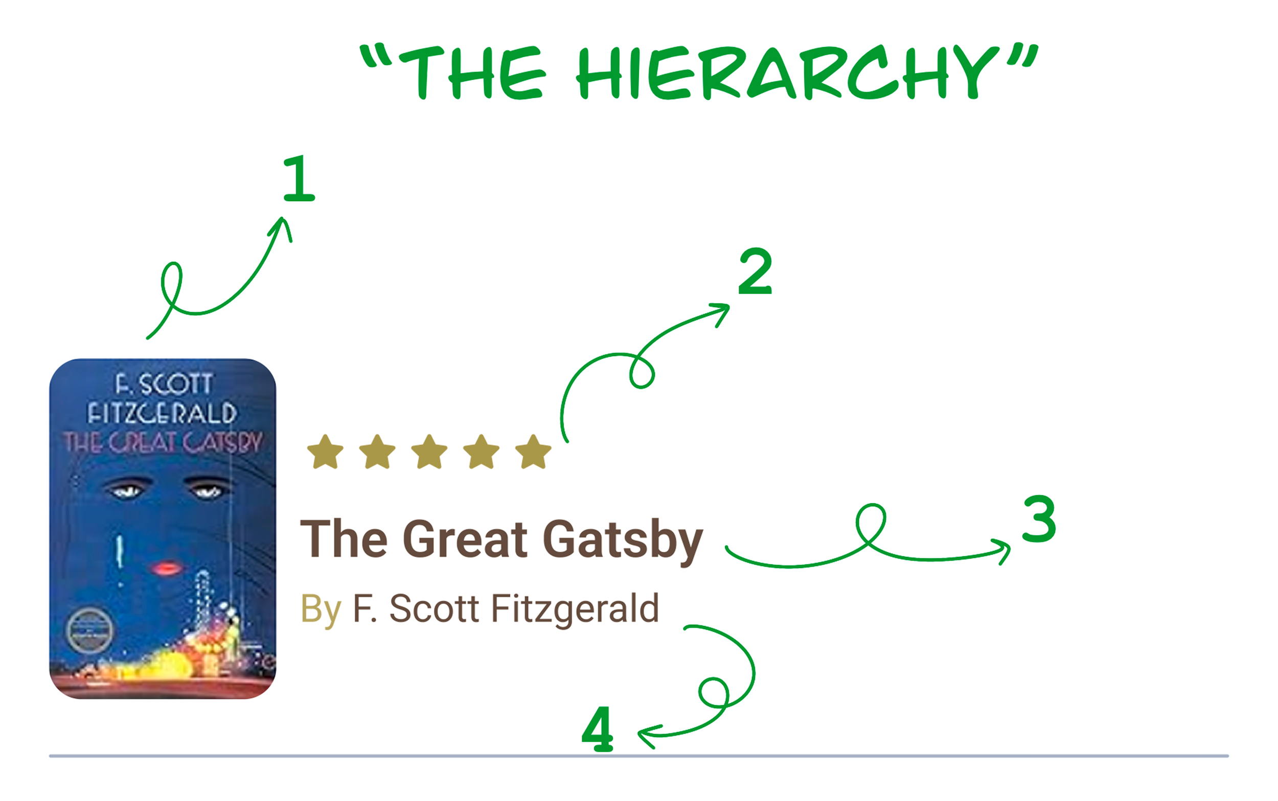
The Suggested Hierarchy
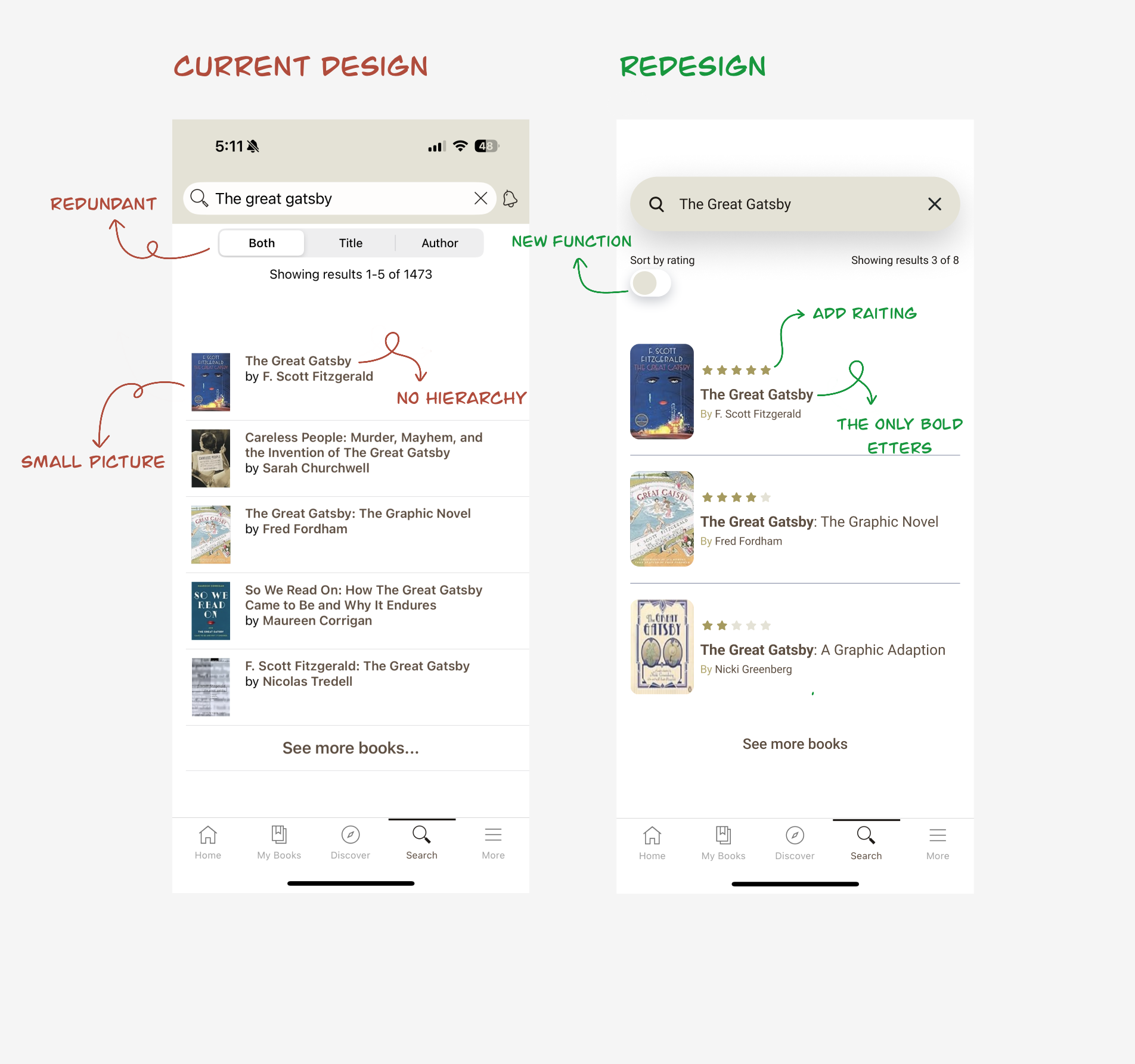
The Crrent design and the redisgn version
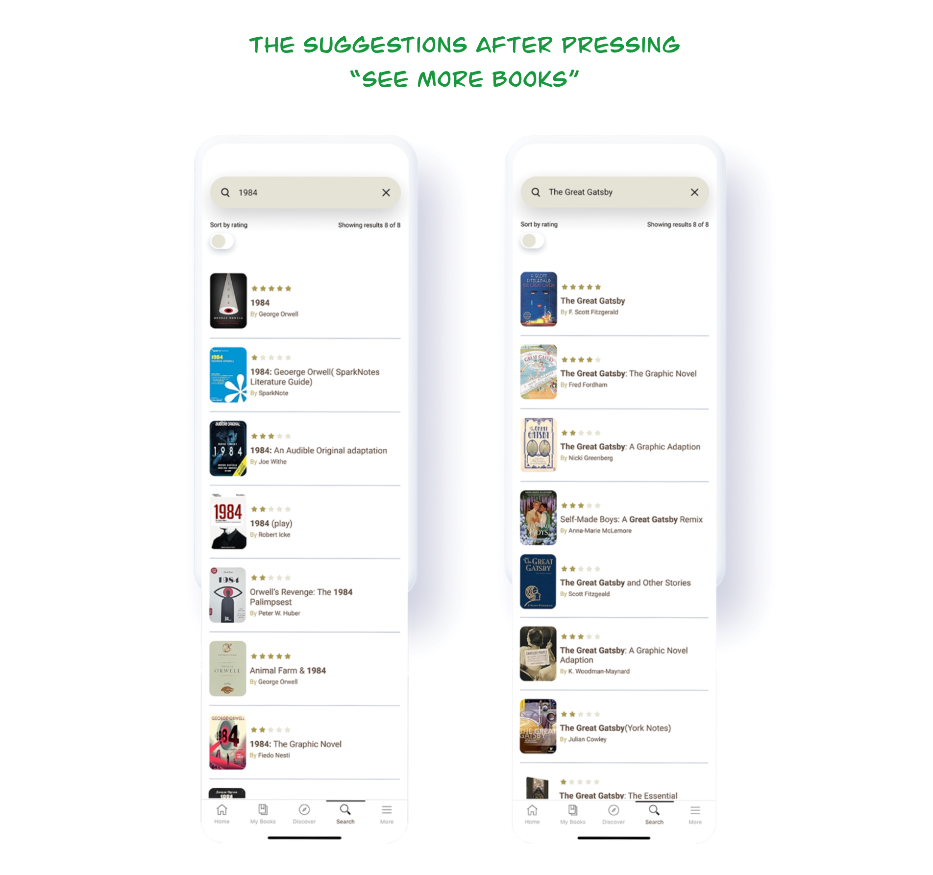
The book suggestions after pressing the see more bottun
Key Findings
• Visual hierarchy is a primary driver of scan efficiency and confidence.
• Removing categorical filters (Title/Author) reduced confusion.
• Higher success rates can be more meaningful than speed alone.
• Aligning with user mental models is critical for efficiency.

Feeling more confidence during the book searching
What This Study Reinforced for Me
• Visual hierarchy is not decoration — it’s a decision-making tool.
• Users expect systems to anticipate intent, not ask them to define it.
• Iteration based on real behavior is where usability improvements become meaningful.