SomniSphere
UI Design for a Human Development Career Platform | A Clear, Trust-Centered Desktop Interface.
01
My role:
Ui designer
02
Timeline:
May 2023 - Jan 2024
03
Tool Used
Figma, Adobby Illustrator
Project Overview
• Create a consistent and trustworthy platform for personal and career development.
• Make personality-test flows clear and engaging.
• Encourage return visits and user loyalty.
• Build a visual identity based on illustrations instead of photography.
Business Goals
• People searching for a suitable career path.
• Users who want to understand and improve their personal and professional capabilities.
Target Users
• Home page with all key services visible.
• Full UI for personality test flows.
• A unified, minimal, illustration-based look.
• Scalability for future features.
Client Priorities
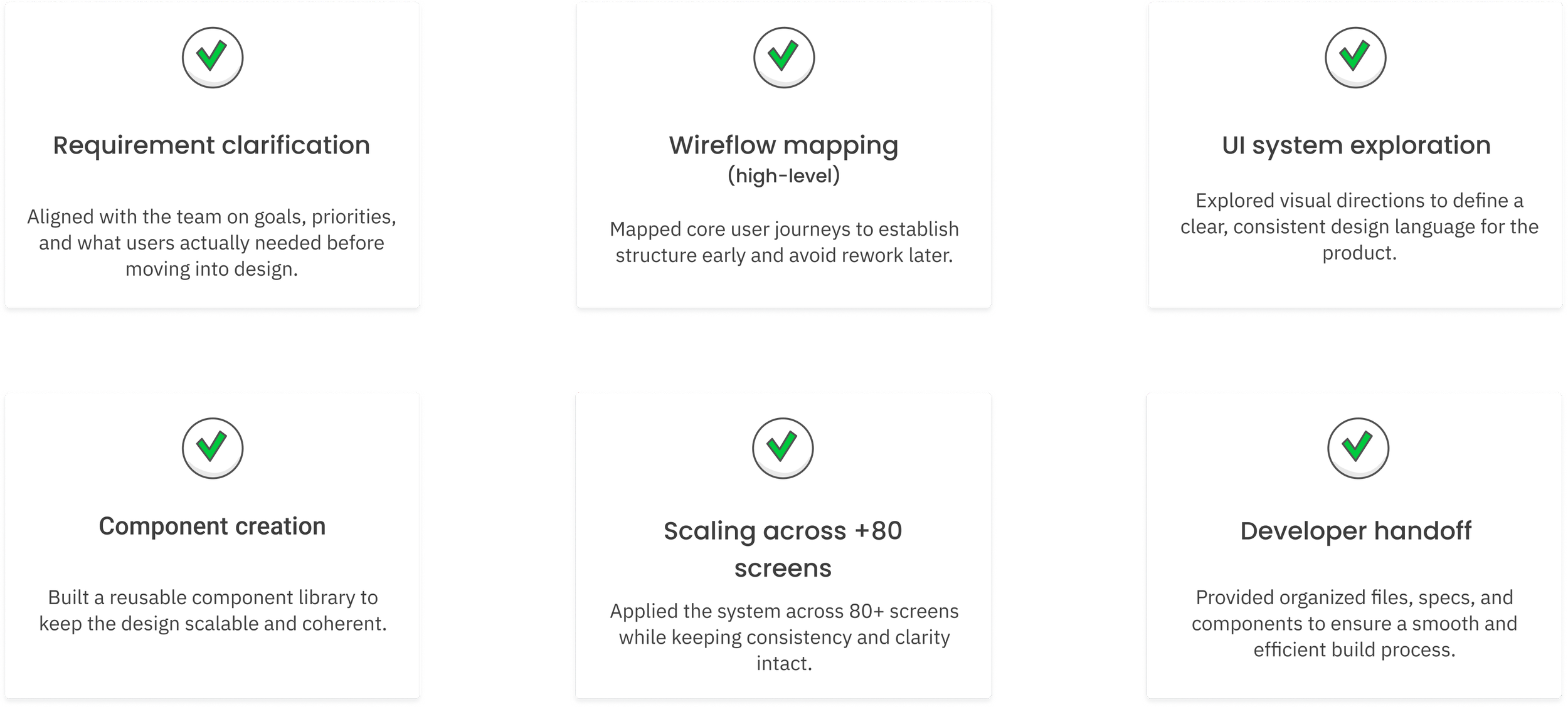
• Lack of clear UX research → required additional clarifications during UI design.
• Very large number of screens (88) with shifting requirements.
• Maintaining visual & component consistency across expanding pages.
• Close collaboration with developers to ensure accurate implementation.
Challenges
My Approach
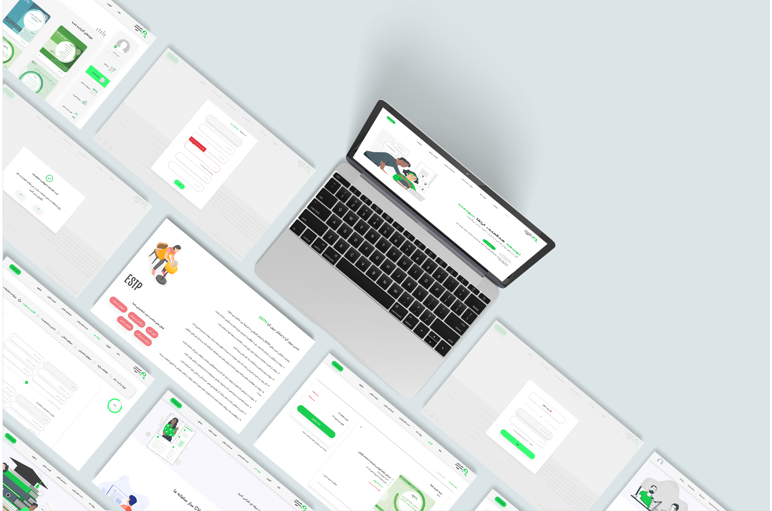
Visual Exploration
I evaluated two visual directions, a clean corporate look vs. an illustration-driven friendly interface.
Considering the product’s need for trust, safety, and approachability, I selected a minimal layout with consistent illustrations to create a warm yet professional tone.
Workflow & Process
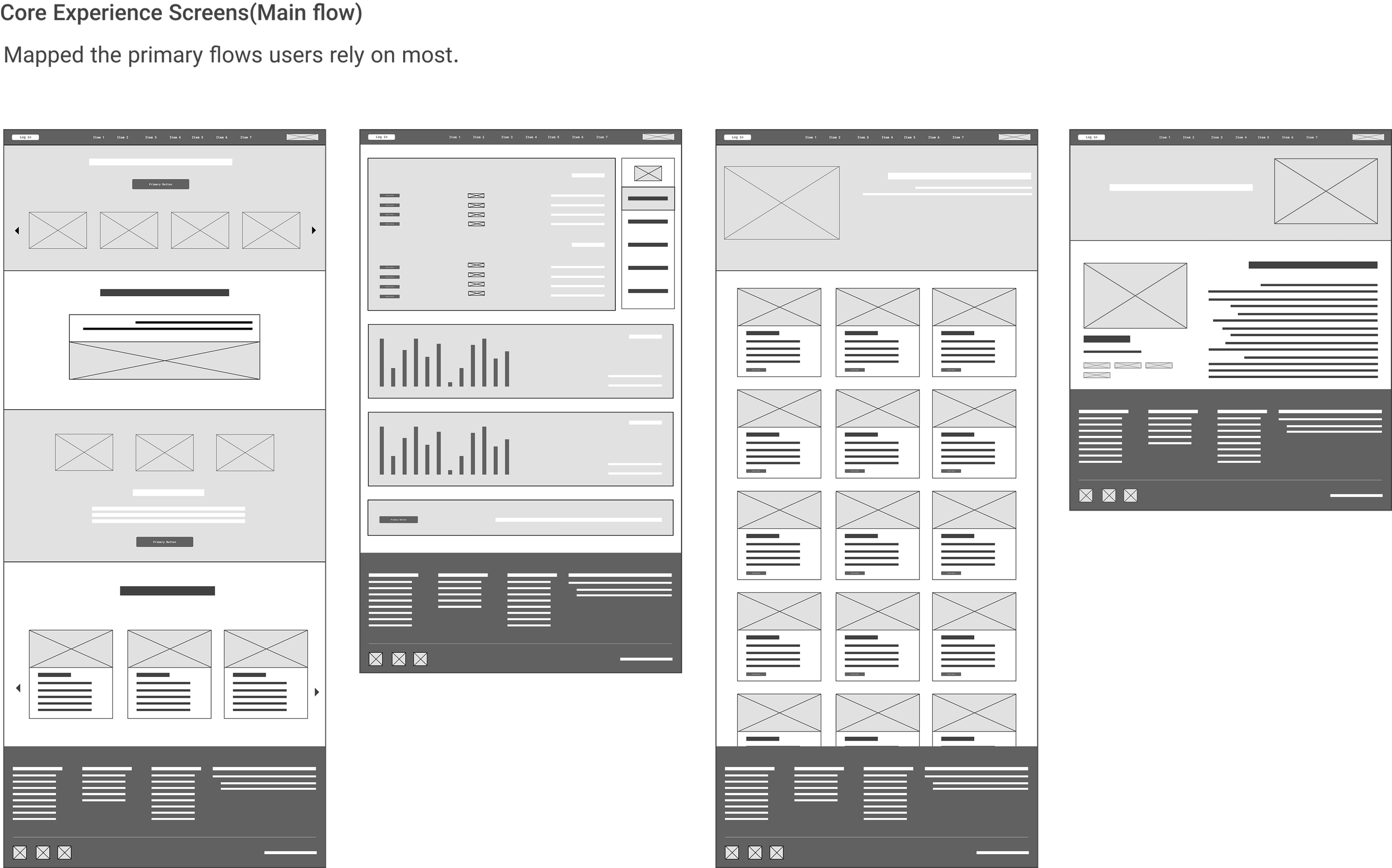
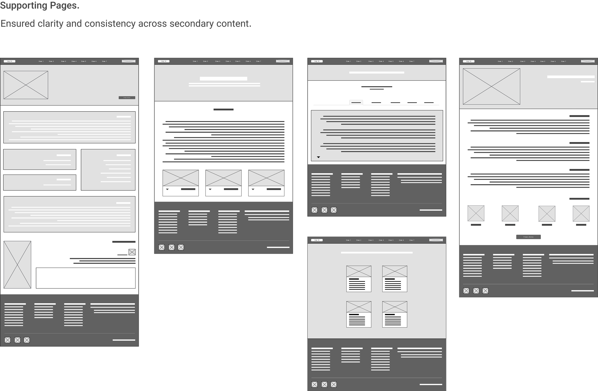
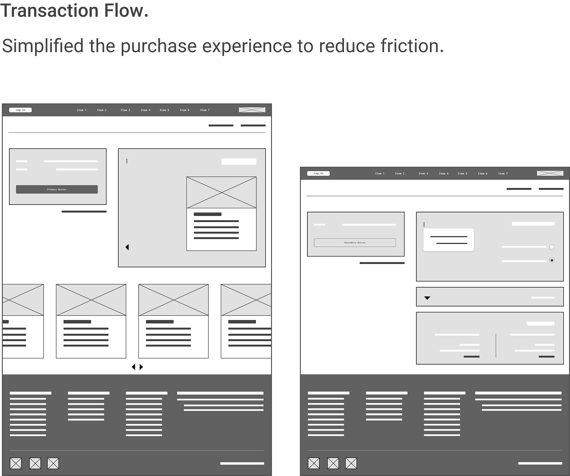
Wireframes | Low-Fi
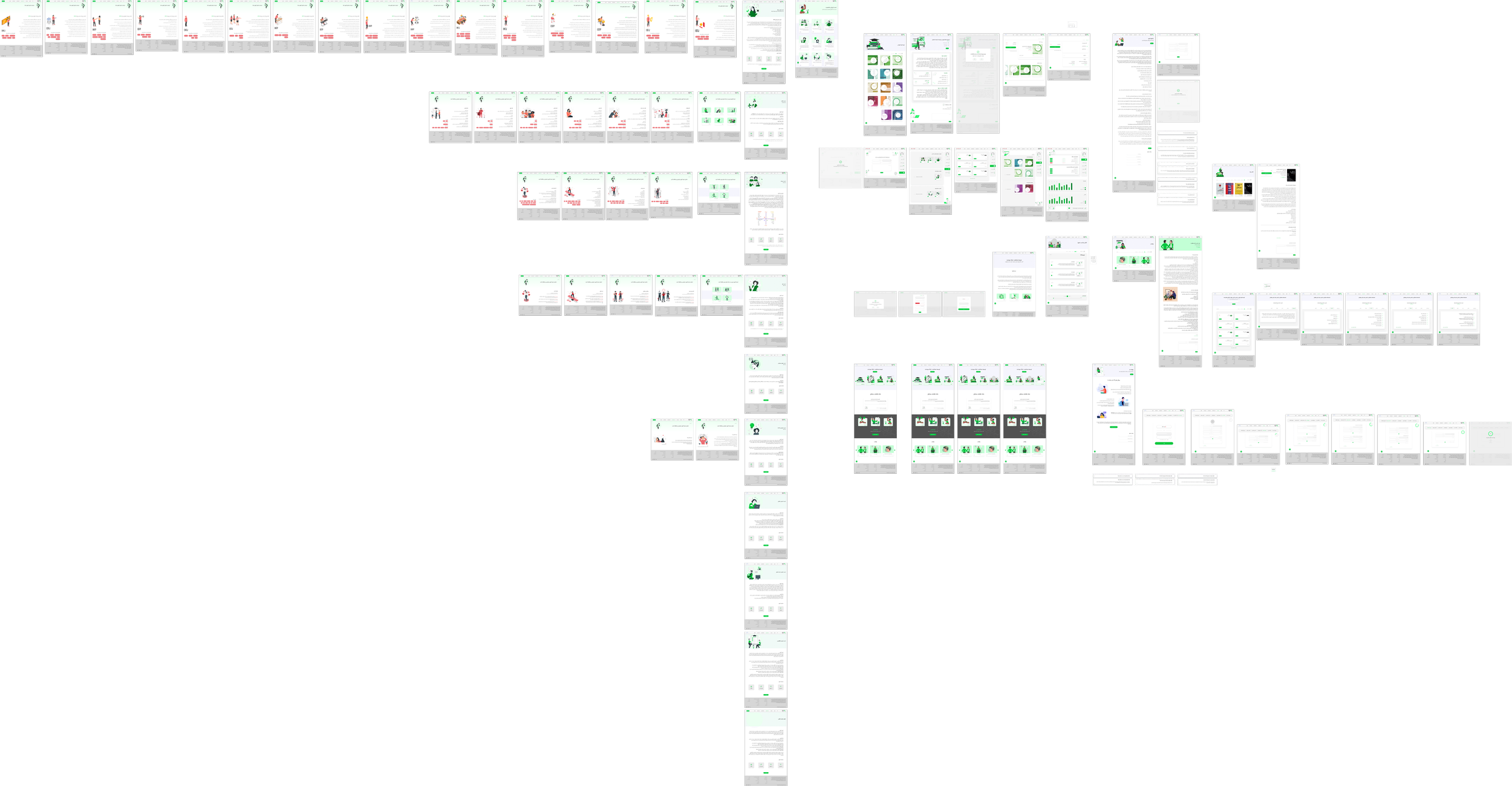
The wireframes helped define the core structure and flow before moving into the high-fidelity UI stage. Since the project included more than 80 screens, this step ensured consistency, logical hierarchy, and a clear foundation for the visual system.
Key screens
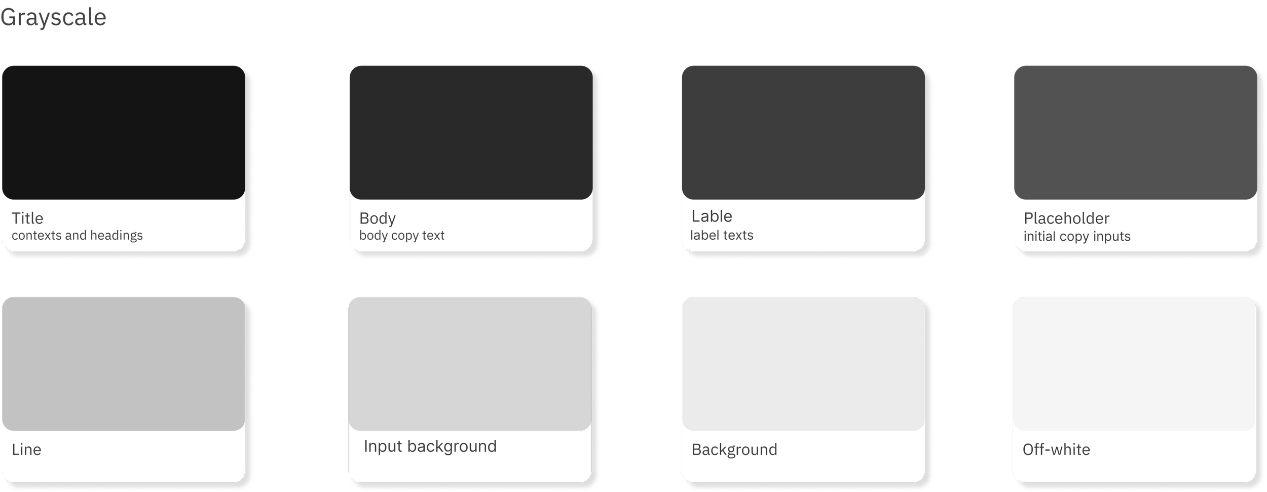
Design System & UI Library
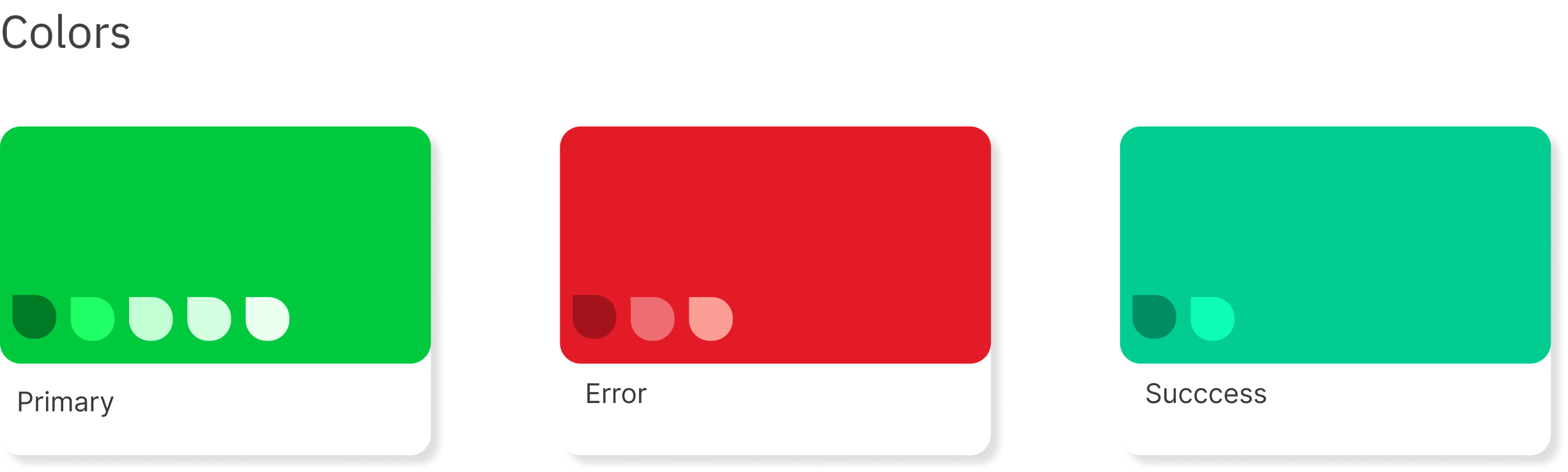
Color pallet
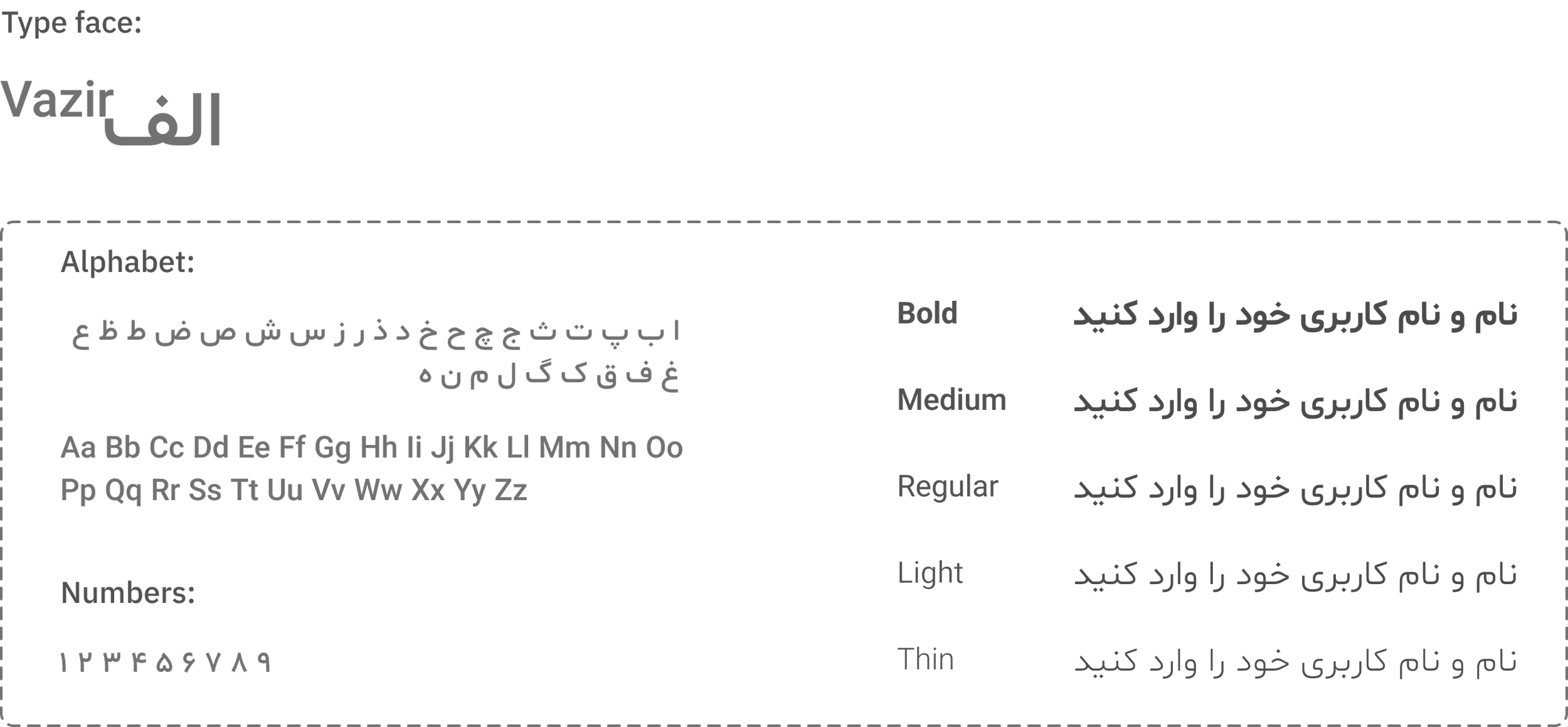
Typography
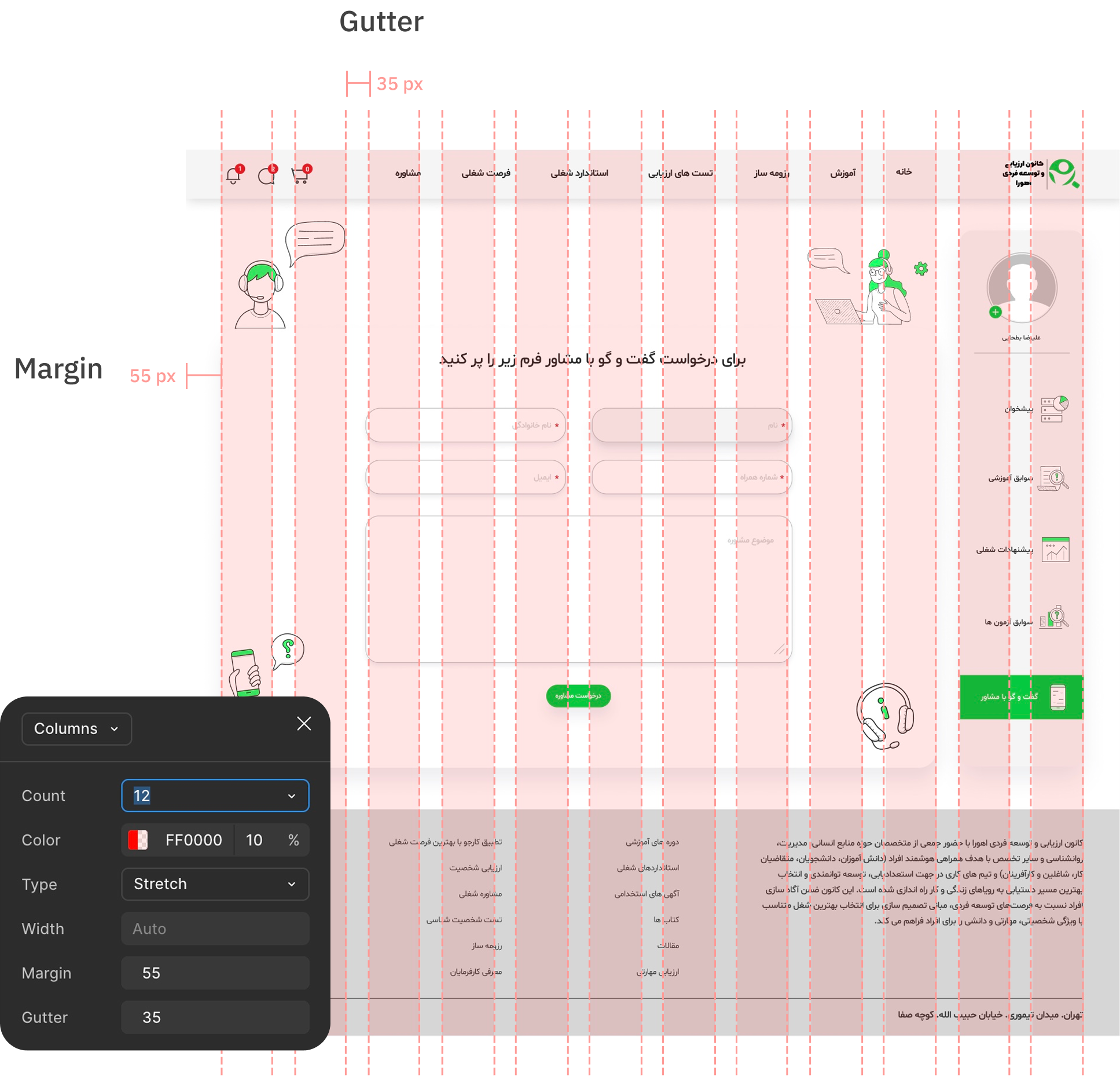
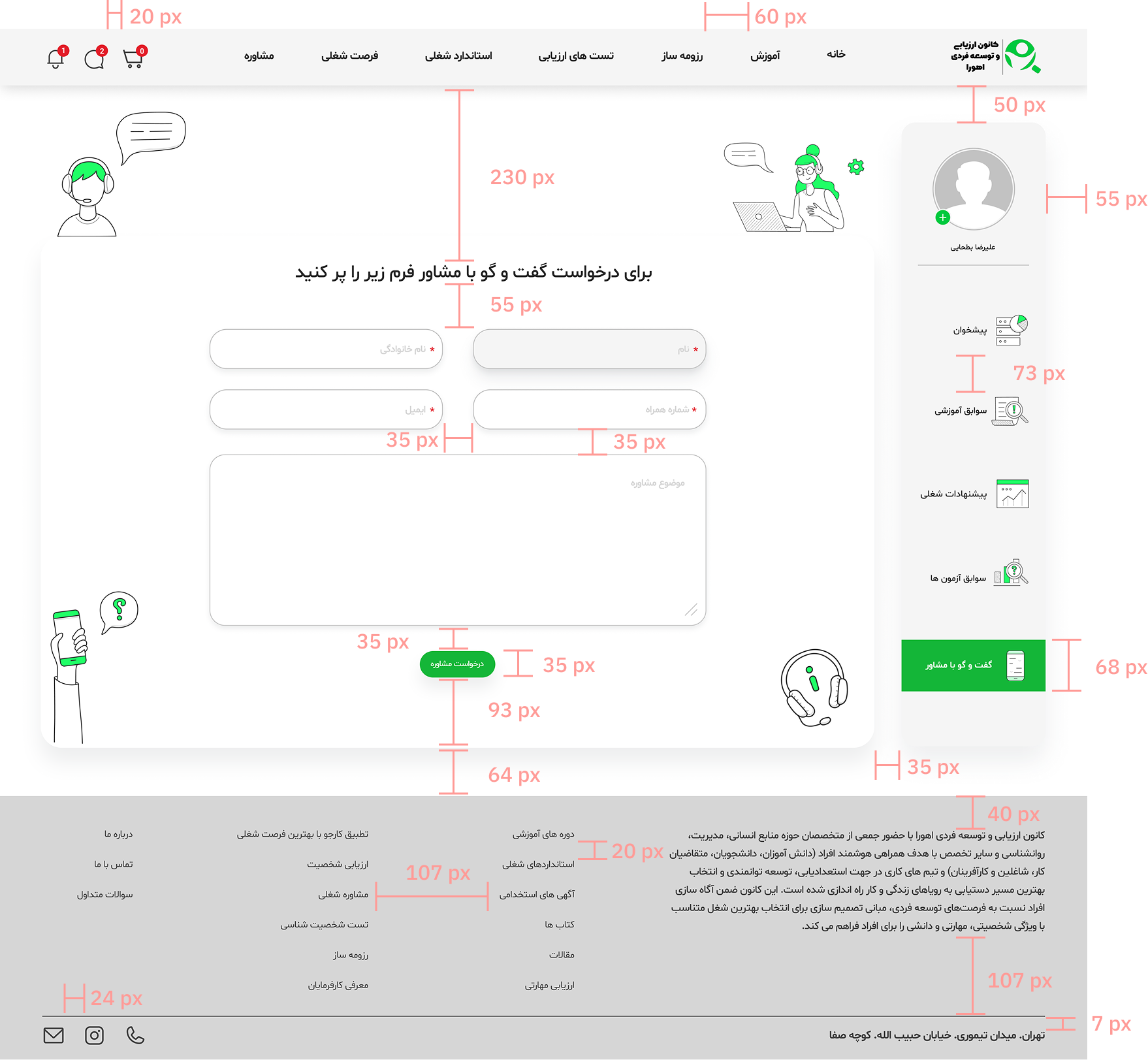
Grid
Icon

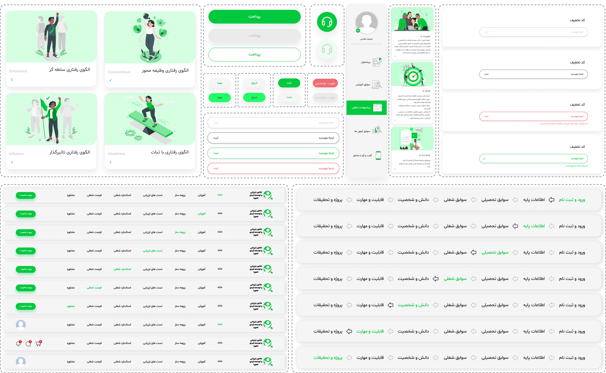
Component
+ 80 Screen 9 Months
The minimal visual style and step-by-step flow;
Reduced cognitive load.
Sped up test completion.
Increased user engagement by up to 30%.
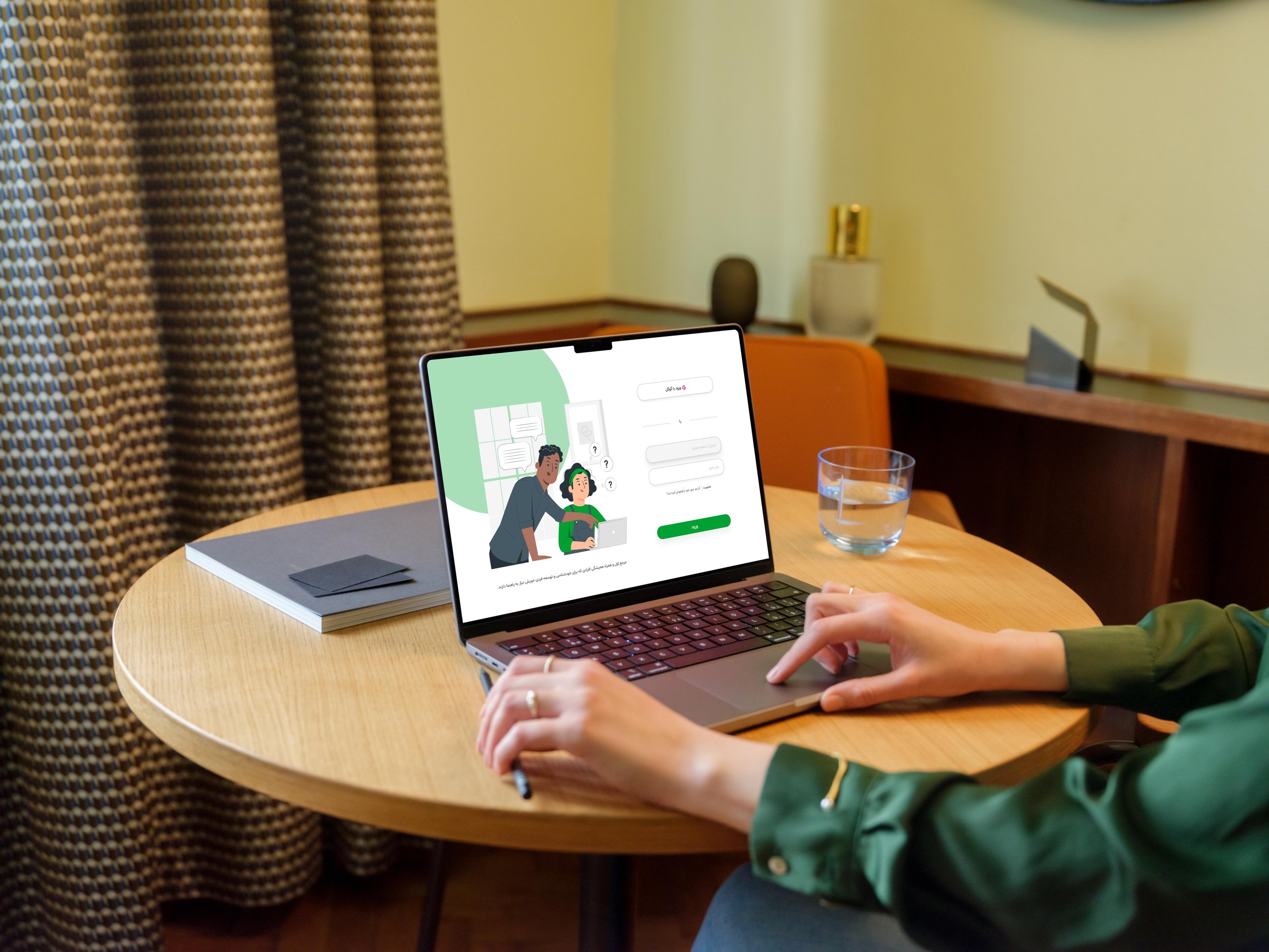
Watch the key user flows in a quick walkthrough!

Output of soft skills & knowledge
This project was my first professional experience in the UI design field, marking my transition from structured learning into real-world product design. It allowed me to face real challenges, strengthen my UI skill set, and apply design principles in a true production environment.
Throughout the process, I collaborated closely with cross-functional teams to align design decisions with business goals while maintaining a strong user-centered approach through continuous feedback and iteration.
The project moved through both design and development phases and was later paused due to changes in the company’s roadmap. Despite this, it became a valuable hands-on experience that deepened my understanding of production-level UI design and professional collab